
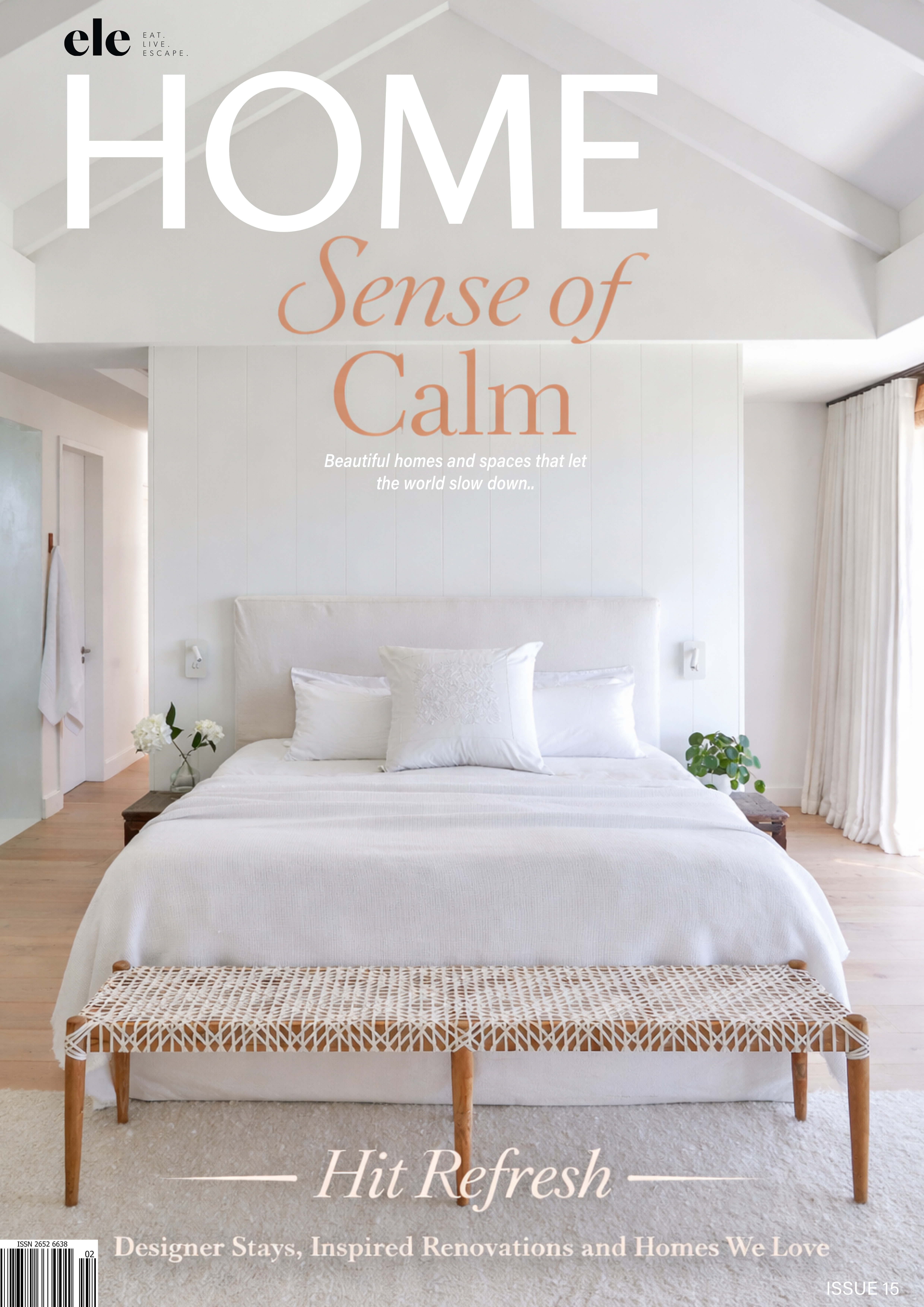
An all-white room can be beautiful in the way a sheet of paper is beautiful: generous, luminous and full of possibility. The difficulty comes when the paper never acquires a mark. White walls, pale upholstery, white cabinetry and a bleached floor may produce an immaculate photograph, yet offer surprisingly little to the people who spend their evenings there. A home needs places for the eye to settle, surfaces that change with the light and enough individuality to make its occupants feel present.
The renewed interest in warm interiors begins here. In our recent exploration of the earthy palette emerging from Milan Design Week, colour and tactile materials take a more expressive role. That observation does not make white obsolete. It suggests a more interesting direction: treating white as one component of a room, while allowing timber, muted colour, pattern and personal possessions to do more of the work.
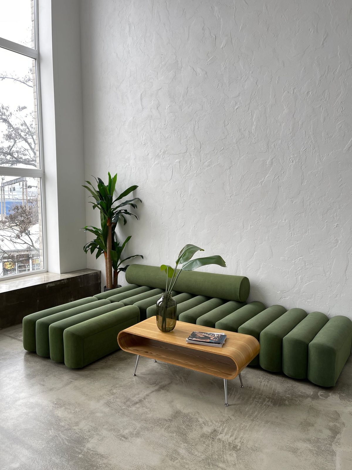
Moving away from all-white interiors can be a modest undertaking. It might mean a tobacco-coloured chair beside an ivory sofa, olive joinery against a chalky wall or a single rug whose faded red brings a room into focus. The most convincing homes seldom announce that they have changed direction. They simply begin to feel richer, more comfortable and more specific.
Why all-white interiors can feel unfinished
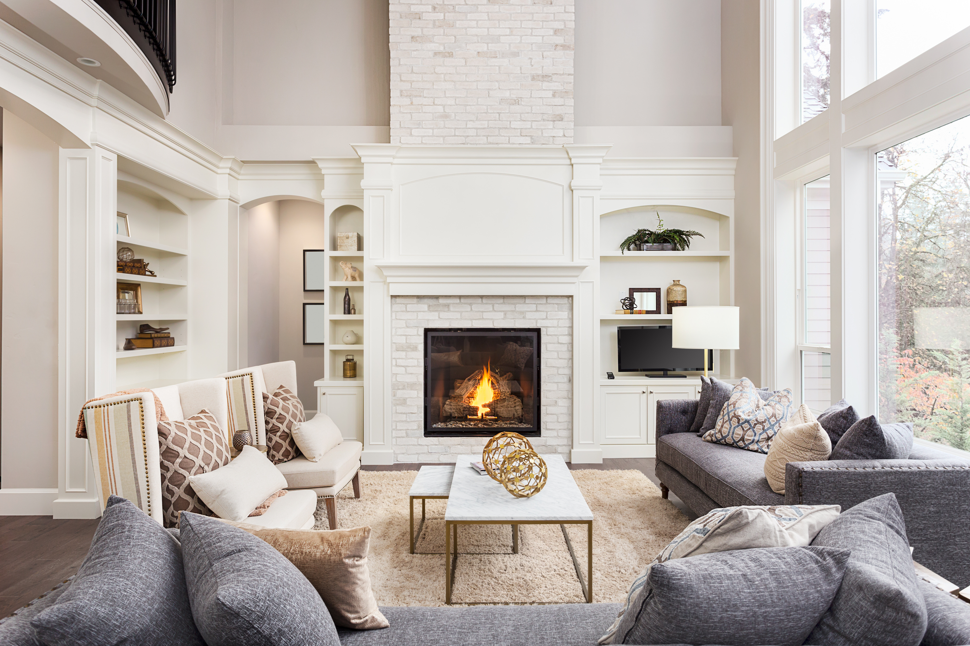
White gained its appeal for understandable reasons. It offers a clear background for art, makes adjacent spaces feel related and can emphasise the shape of a beautiful building. In a room with tall windows, deep reveals and a finely proportioned fireplace, a restrained palette allows the architecture to speak. The problem is assuming that white paint will supply the character that the architecture lacks.
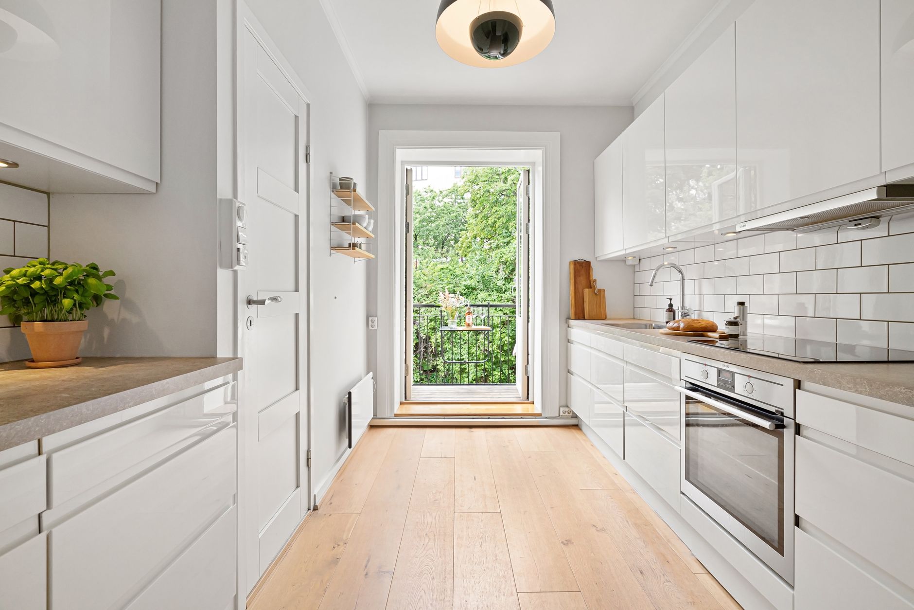
In a plain apartment, several white surfaces of similar brightness can flatten one another. The joinery, walls and furniture merge without giving the eye much information about depth. A glossy white kitchen beside a white dining table may feel particularly abrupt because both surfaces are smooth, hard and visually uniform. Texture and tonal variation create the missing distinctions without requiring a saturated colour scheme.
Practical life matters too. A room built around pristine upholstery demands a particular kind of vigilance, especially where children, pets and cooking share the same space. Choosing a forgiving woven fabric or a patterned rug is a design decision as much as a maintenance decision. A room that permits ordinary use often looks more relaxed because its inhabitants can actually relax within it.
Warmth begins with undertones
The first useful change is to examine the whites already in the room. A blue-white ceiling, creamy curtains and a pinkish stone floor can pull against one another even when everything is technically neutral. Under the evening lamps, the differences may become more obvious. Before adding new colours, establish which existing surface is dominant and whether its undertone is warm, cool or somewhere between the two.
Make large samples and move them beside the flooring, upholstery and kitchen finishes. Look at them in morning daylight and under the lamps you actually use. A colour chosen against an isolated white card tells you much less than one seen alongside the fixed materials it must accompany.
Choose a neutral with some depth
Oat, mushroom, putty and pale clay create different kinds of warmth. An oat wall can suit honeyed timber and tobacco leather; mushroom sits comfortably with charcoal, walnut and soft blue. Pinkish clay can be beautiful with olive, although a strongly yellow floor may change the relationship. These are starting points for testing, rather than ready-made recipes for every home.
There is also a place for white with a softer undertone. If the room receives ample light and its furnishings already carry colour, a chalky white may provide exactly the right breathing space. Understanding white paints can help frame the decision. Keep the question practical: which background makes the room’s existing materials feel most coherent?
Give natural materials a larger role
Warm interiors depend on more than warm paint. The grain of oak, the weave of linen and the slight irregularity of ceramic introduce variation at a scale the eye enjoys. Against white, these qualities become especially legible. A timber sideboard can give an otherwise pale living room a horizontal anchor, while a wool rug supplies a softer field beneath smooth furniture.
Think in terms of neighbouring surfaces. A polished stone table gains interest beside a matte ceramic vessel. Crisp upholstery looks less formal against a loosely woven throw. If every material has the same sheen, a room can appear strangely airless even when its colours are gentle. Build a small family of textures, then repeat selected ones across the room so the result feels connected.
Timber does not have to match perfectly. A darker table can make pale flooring feel intentional, provided another small element repeats its depth. The point is to recognise undertones and distribute them with care. Our rules for mixing wood tones offer a helpful companion when inherited furniture and newer pieces need to share the same space.
Use colour to shape the room
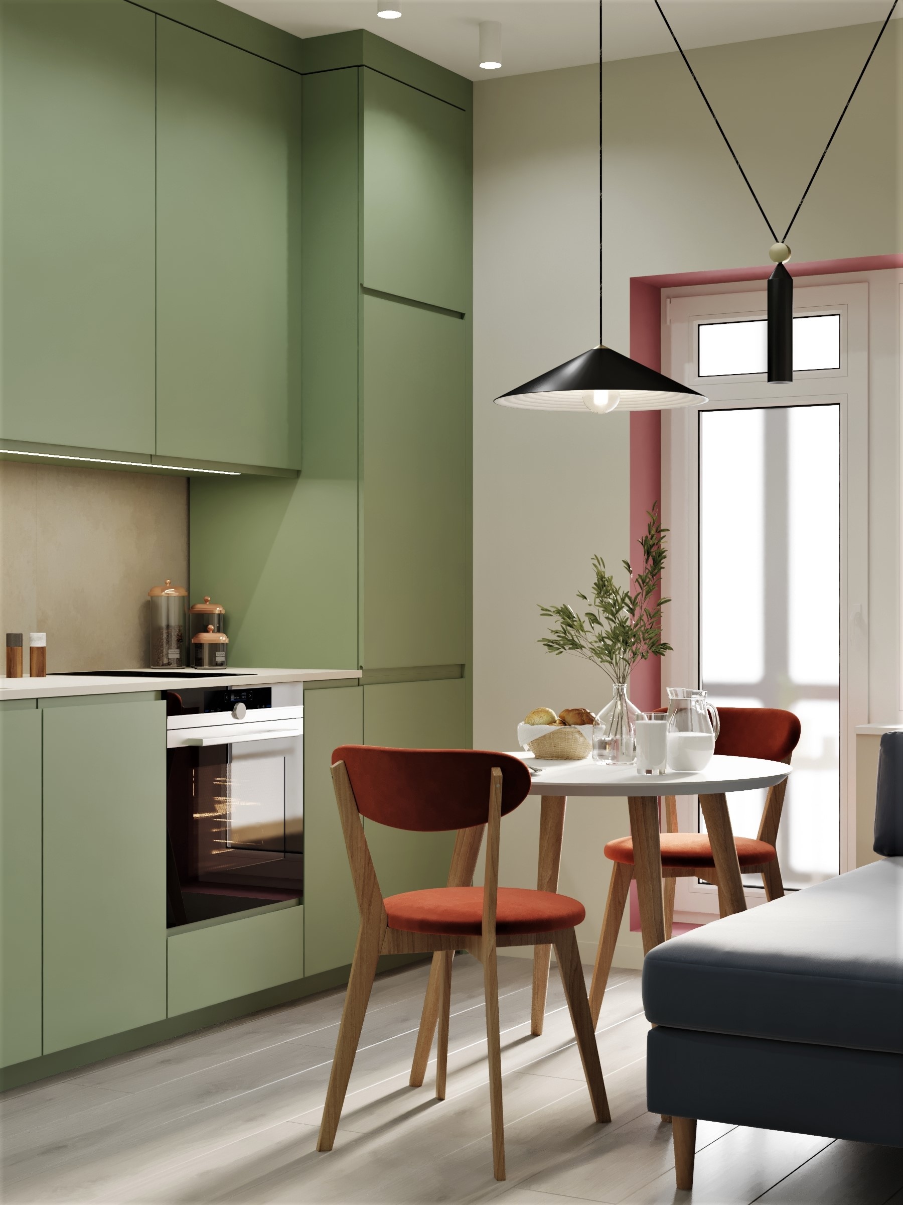
Colour becomes more convincing when it responds to an architectural feature. Painting a bank of shelves olive gives the storage a definite identity. A deep blue hallway can create a measured transition into a brighter living room. A warm ceiling draws attention to the room’s upper volume, especially when its colour is related to curtains or upholstery below.
This approach differs from placing an arbitrary accent wall behind a sofa. The colour has a reason to stop where it stops: a recess, a doorway, a complete run of joinery. In a room without obvious features, painting walls and trim in related tones can establish a calmer envelope. Different finishes allow the same colour to behave differently on plaster and timber.
Decide how much contrast the architecture needs
Colour drenching can make a space feel continuous, while a contrasting ceiling or trim sharpens its edges. Neither treatment is automatically more sophisticated. A room with awkward projections may benefit from continuity; a room with beautiful cornices may welcome definition.
Before committing, photograph the room from its entrance. The image often reveals where a colour boundary would look arbitrary or where a dark element could balance an existing opening. Work with the whole view, including the rooms beyond. A strong colour can be repeated very quietly elsewhere through a lampshade, a book spine or the border of a rug.
Build a palette with a clear point of view
A warm white, muted green and dark timber can make an elegant starting palette. For a more sunlit feeling, consider ivory with terracotta, faded blue and oak. For evening rooms, mushroom, aubergine and brushed metal can create depth without making every surface dark. What matters is the balance of area: the largest colour sets the atmosphere, while smaller notes add tension.
Begin with something you intend to keep. A painting, a rug or a favourite upholstered chair can supply a palette more personal than a collection of disconnected paint samples. Extract one background tone and one stronger colour, then allow the remaining surfaces to support them. The room can still evolve, but its choices will have a common reference.
Avoid buying several inexpensive objects merely to repeat an accent. Repetition works best when it changes form and scale. An earthy red in a rug can return in the lining of a lampshade or a small ceramic bowl. The relationship should be discoverable without becoming a theme that explains itself at every turn.

Pattern brings a room closer to everyday life
Pattern offers something a flat colour cannot: several tones within one surface. A restrained stripe on a chair or a faded floral curtain can bridge white walls and darker furniture. A patterned rug may absorb the visual demands of everyday living while giving a seating group a more complete foundation. Scale matters more than the number of patterns in the room.
Place a larger, looser motif beside a smaller, quieter one. A broad stripe and a fine check can coexist when their colours relate, whereas two equally assertive florals may compete for attention. Leave plain surfaces between them. The eye needs enough stillness to recognise what each pattern contributes.
In a contemporary home, pattern need not imply a traditional decorating scheme. A graphic textile can sharpen a simple sofa, while a vintage rug lends history to clean joinery. The furniture’s silhouette and the architecture’s lines keep the composition current. Pattern then supplies character within a structure that remains disciplined.
Light determines whether warmth feels convincing
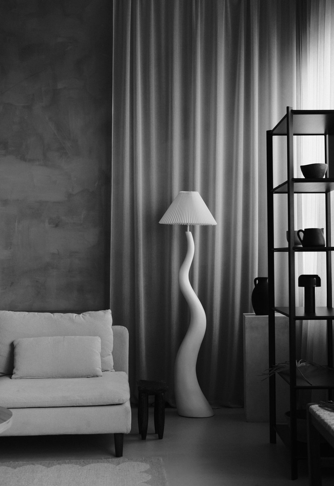
Even the most carefully chosen palette can look uncomfortable under poorly considered lighting. One bright ceiling fitting tends to flatten texture and place the entire room under the same level of illumination. Table lamps, a reading light and a shaded pendant create different pools of light, making the room feel more accommodating after sunset.
Test bulb colour and brightness with the actual shades and finishes. A cream fabric shade can alter the light it transmits; a dark interior lining may direct it downwards. Dimmer compatibility also matters.
Let some areas remain quieter. A softly lit wall beyond a reading chair creates depth, while a lamp beside a timber cabinet can make its grain more visible. Warmth comes partly from this hierarchy. Every corner does not need to announce itself equally, and a statement fixture still needs useful light beneath it.

Start with the elements you can change thoughtfully
An existing white kitchen can gain depth through seating, lighting and a timber dining table before its cabinets are replaced. A pale living room may need a better rug and fuller curtains more urgently than new paint. Spend time identifying the missing quality: colour, scale, texture, storage or comfortable illumination. That diagnosis makes the budget work harder.
For renters, substantial textiles are particularly useful. A large rug, curtains fitted with permission and a distinctive freestanding lamp can change the room’s atmosphere while moving with you later. Choose furniture that suits the space you have, with enough flexibility for another home. Small decorative additions rarely compensate for a sofa that overwhelms the plan.
Allow the room to acquire some evidence of its occupants. A stack of books that are actually read, a handmade bowl and a picture collected over time can make a neutral interior feel inhabited. Beautiful homes gain depth when their materials and possessions have a purpose. White remains welcome within that setting; it simply shares the room more generously.
Frequently Asked Questions
Are all-white interiors going out of style?
White remains a useful and enduring background. The more interesting shift is towards layered rooms with greater tonal and material variety. A white interior with beautiful proportions, timber, textured textiles and personal art can still feel complete. Evaluate how the room works and feels before changing it because of a trend.
How can I make a white living room feel warmer?
Start with a substantial textured rug, timber furniture and lighting at seated height. Add a colour drawn from existing art or upholstery, then repeat it in a different material. Check the undertones of walls and curtains together. One well-scaled change usually contributes more than a scattering of small accessories.
Which colours work best with warm white walls?
Muted olive, terracotta, tobacco, soft blue and burgundy can all work, depending on the white’s undertone and the flooring. Test colours together in the room. A creamy white may behave differently beside a yellow oak floor than beside cool stone, so there is no universally successful combination.
Can an all-white kitchen be updated without renovating?
Yes. Consider timber or upholstered stools, a warmer dining area, a useful lamp where safely located and a small amount of ceramic texture. If painting cabinetry, assess its condition and follow the appropriate preparation system. Begin with reversible changes so you can judge what the kitchen actually needs.
Do warm interiors have to be beige?
Warmth can come from material, lighting and the depth of a palette. Green, aubergine or blue can feel inviting beside timber and soft upholstery. Beige is one option within a much wider range. A room’s comfort depends on its complete composition, including furniture, daylight and the way people use it.
What to Read Next
For a more expressive approach to combining furniture and pattern, read How to Style Eclectic Interiors.
If you are deciding how much colour a compact room can carry, explore Budget-Friendly Colour Trends to Transform Your Small Space.
To develop the atmosphere beyond the palette, continue with How to Create a Calm and Beautiful Home.
Leave a Reply