The world’s largest design fair, Milan’s Salone del Mobile, has long been considered the international benchmark for interior design. Each year, it offers a thoughtful glimpse into the colours, materials, furniture shapes and design ideas that will influence homes, hotels, restaurants and public spaces in the years ahead.
This year the message was clear. Interiors are becoming warmer, richer and far more layered.
After years of crisp white spaces, cool greys and sometimes severe minimalism, design is moving toward rooms that feel deeply personal, tactile and comforting. The new mood is about softness, craftsmanship and atmosphere. It is less about perfect restraint and more about creating homes that feel generous, calm, cocooning and beautifully lived in.
Across the fair, colour palettes embraced earthy hues of brown, ochre, terracotta, moss green and warm beige, while deeper tones such as burgundy, aubergine and chocolate added a sense of luxury and intimacy. These colours do not shout for attention. Instead, they wrap a room in warmth.
Interestingly, many of the palettes seen at Salone reflect what is already happening in Australian interiors. From richly painted living rooms to tonal bedrooms, textured bathrooms and kitchens layered with stone, timber and warm neutrals, the shift toward earthy colour and natural materiality feels perfectly suited to the way we live.
A Warmer Direction for Modern Interiors
The most noticeable design direction from Salone del Mobile was the move away from cool minimalism and into warmer, more expressive interiors. This does not mean rooms are becoming cluttered or overly decorative. Instead, the new version of luxury is layered, tactile and quietly confident.
Colour is being used to create feeling. Rather than simply painting a wall white and relying on furniture to do the work, designers are using rich, enveloping tones to build ambience from the ground up.
Think:
Soft terracotta walls in a dining space
Chocolate brown upholstery in a living room
Moss green cabinetry in a kitchen
Ochre accents in cushions and artwork
Warm beige walls instead of stark white
Deep burgundy used as a dramatic anchor tone
Aubergine or plum in small but powerful doses
This colour direction reflects a broader movement in today’s interiors. Homes are being designed as sanctuaries, offering calm and comfort from the noise of the outside world. The result is not gloomy or heavy. Done well, these palettes feel elegant, grounded and incredibly inviting.

Earthy Colours Are the New Neutrals
For years, neutral interiors were dominated by cool whites, pale greys and clean monochrome schemes. Now, the idea of a neutral has expanded.
Warm beige, clay, sand, taupe, caramel, tobacco, olive and soft brown are becoming the foundation colours of contemporary homes. These shades still offer flexibility, but they bring much more depth and warmth than cooler neutrals.
This is especially useful in Australian homes, where strong natural light can make cool whites feel stark. Warmer neutrals tend to soften a room, making it feel more relaxed and liveable.
A colour such as Wattyl Bleached Hemp, for example, offers a subtle beige backdrop that works beautifully with richer accents. Used on walls, it can soften a living space while allowing deeper tones, such as burgundy, olive green or rich pink, to feel layered rather than overpowering.
The appeal of these earthy neutrals is their versatility. They work in almost every room, from kitchens and bathrooms to bedrooms and living spaces. They also pair beautifully with natural materials, including timber, stone, linen, rattan, wool, boucle and aged metals.
Burgundy, Chocolate and Aubergine Add Quiet Drama
While warm neutrals formed the foundation at Milan, deeper colours brought the drama. Burgundy, chocolate, aubergine, oxblood and deep plum appeared across furniture, walls, textiles and styling details.
These shades have a strong cocooning quality. They make a room feel intimate without needing to be dark or overly formal.
A burgundy such as Wattyl Seductress can be especially striking when paired with softer or more playful shades. In one colour direction, saturated burgundy was layered with the pink of Wattyl Tisty Tosty and the cerulean blue of Wattyl Veronica, creating a room that felt nurturing, expressive and unexpectedly fresh.
This is the key to using deeper hues well. They do not always need to be paired with other dark colours. A rich burgundy can look beautiful with powder blue, pale pink, olive green, warm beige or natural timber. The contrast keeps the palette modern rather than heavy.
For those who are nervous about using deeper paint colours, start with a smaller space. A powder room, reading nook, hallway, dining room or bedroom wall can be the perfect place to experiment.
Why Powder Blue Still Matters
Among the earthy hues and saturated tones, powder blue offered a softer counterpoint. It brought freshness and lightness to otherwise warm palettes, proving that cool colour still has a place in contemporary interiors when used with care.
Powder blue works particularly well with terracotta, rust, warm beige, pale timber and chrome. It can also soften richer shades such as burgundy, chocolate and olive.
In interiors, powder blue can be used through:
Painted joinery
Bed linen
Upholstered chairs
Bathroom tiles
Lampshades
Artwork
Decorative ceramics
A ceiling or small feature wall
The beauty of powder blue is that it can shift depending on what surrounds it. With white, it feels crisp and coastal. With terracotta, it feels Mediterranean. With burgundy, it feels polished and fashion forward. With pale timber and chrome, it feels quietly modern.
Texture and Materiality Are Just as Important as Colour
Colour may have been one of the major stories at Salone, but materiality was just as important. The most compelling interiors were not built around colour alone. They were layered with tactile, textured and organic materials that made each space feel more human.
The dominant materials and finishes included:
Raw and textured linen
Velvet
Boucle
Wool
Natural stone
Pale and dark timbers
Terracotta
Ceramics
Chrome
Brushed metals
Woven fibres
Soft matte paint finishes
Organic forms and sculptural shapes were also everywhere. Furniture felt rounded, generous and comfortable, with fewer hard edges and more emphasis on shape, proportion and touch.
This is an important lesson for home interiors. A warm colour palette will always feel more elevated when it is supported by texture. A beige room can fall flat if everything is smooth and plain. Add boucle, timber, stone, linen and ceramics, and suddenly the space feels layered and considered.
How to Use Warm Earthy Colours at Home
One of the reasons this palette direction feels so relevant is that it can be adapted to many different interior styles. It suits contemporary homes, heritage properties, Mediterranean inspired spaces, minimalist rooms, country homes and apartments.
The key is to decide how much warmth and depth you want.
For a subtle look
Use warm whites, beige or soft sand tones on the walls, then add earthy colour through cushions, rugs, artwork, ceramics and throws.
Try pairing:
Warm beige walls
Olive cushions
A terracotta vase
Natural linen curtains
Pale timber furniture
A chocolate brown accent chair
This creates a calm, layered look without feeling too bold.
For a richer look
Use a deeper colour on a feature wall, cabinetry, bedroom, dining room or powder room. Burgundy, moss green, aubergine or chocolate can create a dramatic but sophisticated effect.
Pair deeper colours with:
Warm white ceilings
Soft neutral flooring
Textural fabrics
Stone or marble
Brass, chrome or aged bronze
Natural timber
This keeps the room balanced and liveable.
For a playful look
Mix saturated colours with softer pastels. A burgundy wall can look fresh with powder blue. Olive green can work beautifully with pale pink. Terracotta can be softened with butter yellow or warm cream.
The goal is to make the palette feel expressive rather than overly matched.

The Best Rooms for Earthy Colour Palettes
The beauty of warmer, earthy interior colours is that they work across the whole home. They can create quiet luxury in formal spaces, calm in private rooms and warmth in practical areas such as kitchens and bathrooms.
Living rooms
Living rooms are ideal for earthy palettes because they benefit from warmth and depth. Try warm beige walls, olive green cushions, chocolate upholstery, burgundy accents and timber furniture.
A living room does not need to be dark to feel cosy. Even a soft neutral base can feel cocooning when layered with rich textiles and natural materials.
Bedrooms
Earthy tones are especially suited to bedrooms because they help create a restful atmosphere. Consider warm white, clay, soft beige, muted pink, tobacco, olive or plum.
Pair these colours with linen bedding, textured throws, soft lamps and natural timber for a bedroom that feels calm but not plain.
Kitchens
In kitchens, earthy colour can add depth to cabinetry, tiles or paint. Moss green, warm taupe, clay, deep brown and muted burgundy can all work beautifully when paired with stone, timber, aged brass or chrome.
For a softer approach, keep cabinetry neutral and introduce colour through tiles, stools, lighting or ceramics.
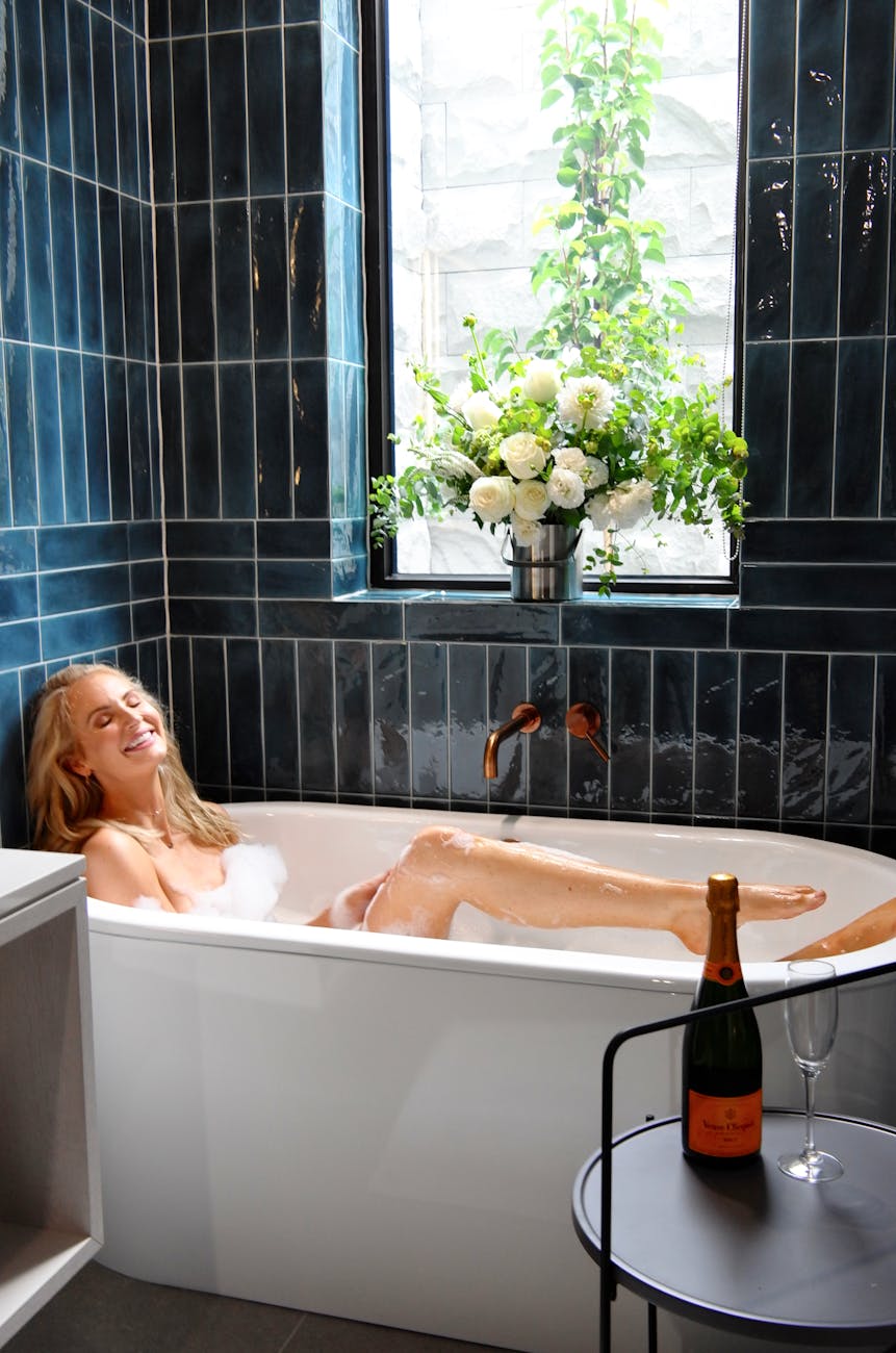
Bathrooms
Bathrooms are often dominated by white, grey and chrome, but earthy tones can make them feel warmer and more spa like. Consider terracotta tiles, beige walls, warm stone, olive towels, timber vanities and soft lighting.
Powder blue can also be beautiful in bathrooms, particularly when paired with rust, white, chrome and natural textures.
Dining rooms
Dining spaces are a perfect place to be more expressive. A rich wall colour such as burgundy, aubergine or chocolate can make the room feel intimate and memorable, especially in the evening.
Add candles, textured linen, ceramics and warm lighting to complete the look.
Paint as a Tool for Atmosphere
One of the easiest ways to bring this Milan inspired palette into the home is through paint. Unlike furniture or renovation work, paint can completely transform a room without requiring a full redesign.
Before committing, use sample pots and swatches to test how a colour behaves throughout the day. Natural light, artificial light, flooring and surrounding furniture can all change how a colour appears.
Wattyl sample pots and colour swatches are available from Wattyl Paint Centres, Mitre 10, Home Hardware and Crowies stores, and can also be ordered online via Wattyl.
When testing colour, paint large swatches on different walls and look at them in morning light, afternoon light and evening light. A beige that feels perfect at midday may look cooler at night. A burgundy that feels dramatic in one room may feel soft and elegant in another.
Sustainability and Low VOC Paints
As interiors become more focused on wellness, comfort and sanctuary, sustainability is no longer a side note. It is increasingly central to how people choose materials, finishes and products for their homes.
Wattyl I.D Advanced interior paint features an ultra low VOC formula of less than 1g per litre, making it one of the lowest VOC interior paints available on the Australian market. Lower VOC paints can help support better indoor air quality after painting, which is especially important in bedrooms, living spaces and family homes.
Wattyl I.D Advanced is available in Matt, Low Sheen and Satin finishes, along with a supporting ceiling product. The different sheen levels allow homeowners and designers to choose the right finish for each room, from soft matte walls to more durable surfaces in high traffic areas.
How to Make the Trend Feel Timeless
The biggest risk with any trend is overcommitting to a look that quickly dates. The best way to use the Milan colour direction is to treat it as inspiration rather than a strict formula.
To keep the look timeless:
Choose warm neutrals for larger surfaces
Use deeper colours in considered doses
Layer texture rather than relying on colour alone
Mix old and new pieces
Avoid overly matching furniture sets
Use natural materials wherever possible
Let rooms feel collected rather than overly styled
A warm, earthy interior should feel comfortable, personal and enduring. It should not feel like a showroom.
This is where Australian interiors are particularly well positioned. Our homes already tend to embrace natural light, indoor outdoor living, relaxed furniture and layered textures. The Milan palette simply gives this approach more richness and sophistication.
The Wrap
The latest direction from Milan’s Salone del Mobile confirms what many designers and homeowners are already feeling. Interiors are becoming warmer, softer and more emotionally connected.
The colours leading this shift, from terracotta, ochre and moss green to burgundy, chocolate and powder blue, are not just decorative. They are atmospheric. They create rooms that feel grounding, expressive and deeply liveable.
For Australian homes, this palette feels especially relevant. It works with natural materials, strong light, relaxed living and a growing desire for spaces that feel like a retreat.
Whether used through a full room transformation or a simple update with paint, textiles and texture, warm earthy colour is one of the most beautiful ways to bring depth, comfort and quiet luxury into the home.
FAQs: Milan Design Week Interior Trends and Earthy Colour Palettes
What were the biggest interior trends from Milan’s Salone del Mobile?
The strongest trends included warm earthy colour palettes, layered materiality, sustainable design, organic shapes, sculptural furniture and a move away from stark minimalism. Interiors felt more tactile, expressive and comforting.
What colours are trending in interiors?
Warm, earthy colours are leading the way, including brown, ochre, terracotta, moss green, warm beige, burgundy, aubergine and chocolate. Powder blue is also emerging as a softer contrast colour.
Are grey interiors out of style?
Grey interiors are not completely out, but cooler grey schemes are being replaced by warmer neutrals such as beige, sand, taupe, clay and soft brown. These tones tend to feel more inviting and work beautifully with natural materials.
How do I use burgundy in home interiors?
Burgundy can be used on walls, upholstery, cushions, artwork or cabinetry. To keep it modern, pair it with warm beige, powder blue, olive green, pale pink, timber, stone or chrome.
What colours go with terracotta?
Terracotta pairs beautifully with warm white, beige, olive green, rust, powder blue, chocolate brown, natural timber and soft pink. It works especially well in living rooms, bedrooms, bathrooms and outdoor spaces.
How can I make earthy colours feel modern?
Use clean lines, sculptural furniture, matte finishes and contemporary materials such as chrome, stone and pale timber. Avoid making everything too rustic. The most modern earthy interiors balance warmth with restraint.
What is layered materiality in interior design?
Layered materiality means combining different textures and finishes to create depth. This could include linen, velvet, boucle, timber, stone, ceramics, metal, terracotta and woven fibres in one room.
Are warm neutrals good for Australian homes?
Yes. Warm neutrals often work beautifully in Australian homes because they soften strong natural light and pair well with timber, stone, linen and indoor outdoor living.
What is low VOC paint?
Low VOC paint contains lower levels of volatile organic compounds, which can help reduce paint fumes and support better indoor air quality after painting.
How do I test paint colours before choosing?
Use sample pots or swatches and test the colour on different walls. Look at it in morning light, afternoon light and evening light before making a final decision.
Read Next
If you love the warm, layered direction coming out of Milan, continue the mood with these ELE HOME reads.
Colour Drenching vs Colour Capping: Which Interior Trend Suits Your Space?
A practical guide to using rich, enveloping colour at home, from deep greens and earthy browns to warm neutrals and dusty blues.
12 Ways to Make Your Home Feel Instantly More Luxurious
Simple styling ideas for creating a more polished home with soft whites, beige, taupe, muted earth tones and layered textures.
How to Create a Calm and Beautiful Home, Design Ideas That Work
For anyone drawn to interiors that feel warm, restful and quietly considered, this guide explores colour, lighting, texture and layout.
Spa Bathroom Ideas: How to Create a Wellness Bathroom at Home
Take the earthy palette into the bathroom with natural tones, stone, layered lighting, plush towels and a more serene approach to everyday rituals.
The Nostalgic Interiors Trend Taking Over Australian Homes This Autumn
A beautiful companion read on curved furniture, boucle upholstery, ceramic lamps, woven rugs and matte finishes.
The Best White Paints for Your Home
If you are starting with a neutral foundation, this guide will help you choose the right white before layering in warmer, earthier tones.
Amalfi Coast-Inspired Interiors: How to Bring La Dolce Vita into Your Home
For a sunnier take on warm interiors, this guide explores Mediterranean colour, natural textures, citrus accents and relaxed coastal elegance.


Leave a Reply