From fashion to film, nostalgia is everywhere right now. And as the temperature drops and we spend more time indoors, that craving for familiarity is showing up in our homes too.
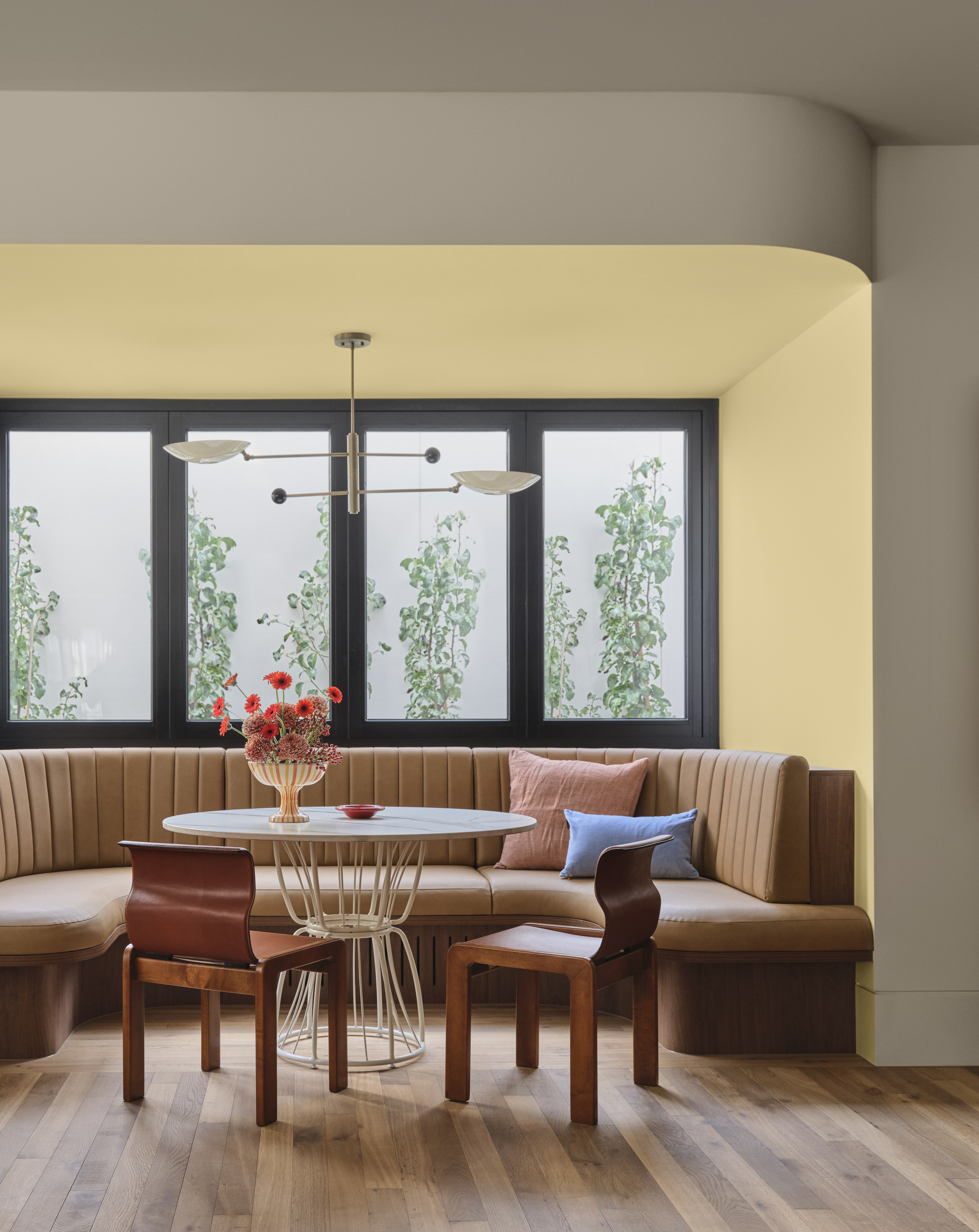
This autumn and winter, Australians are leaning into colours that feel emotionally rich, warm, and comforting. According to Dulux colour forecasters, retro inspired hues are making a strong return, think blush pinks, burnt oranges, warm golds, and deep gem tones.
It is less about stark minimalism and more about atmosphere. Spaces that feel layered, expressive, and lived in.

The Rise of Retro Hues
At the centre of this movement is the Evoke palette from Dulux. It embraces dramatic yet grounding tones that prioritise warmth and comfort, delivering a nostalgic charm with a refined, modern edge. Key colours shaping the trend include:
Dulux Germania and Dulux Tupelo Honey
Rich golden tones that instantly warm a room. These shades work beautifully in living areas and dining spaces, creating a cocoon like glow that feels inviting during cooler months.
Dulux Deep Aqua and Dulux Misty Grape
Deep gem tones that encourage creativity and individuality. Perfect for feature walls, studies, or powder rooms, these colours add depth and personality without overwhelming a space.
Dulux Baked Clay
A dusty pink that feels grown up rather than sugary. It can act as a subtle neutral or a statement backdrop, depending on how it is styled.
These tones move away from cool greys and clinical whites, replacing them with something more emotive.

Why Nostalgia Feels Right Now
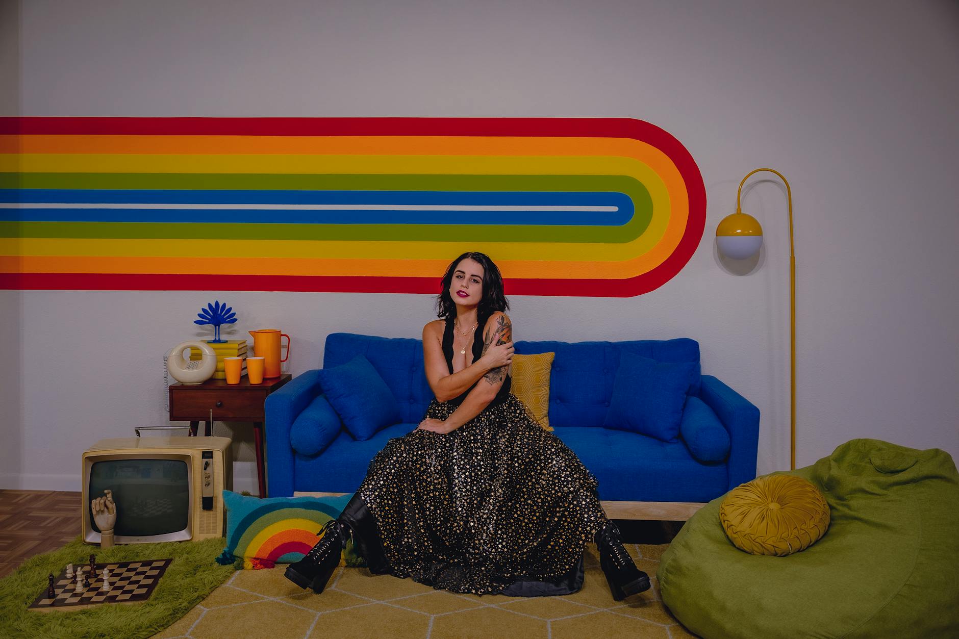
There is a reason retro colours resonate so strongly. They connect us to familiar eras, expressive 1970s design, expressive maximalism, earthy palettes, curved silhouettes, and tactile finishes.
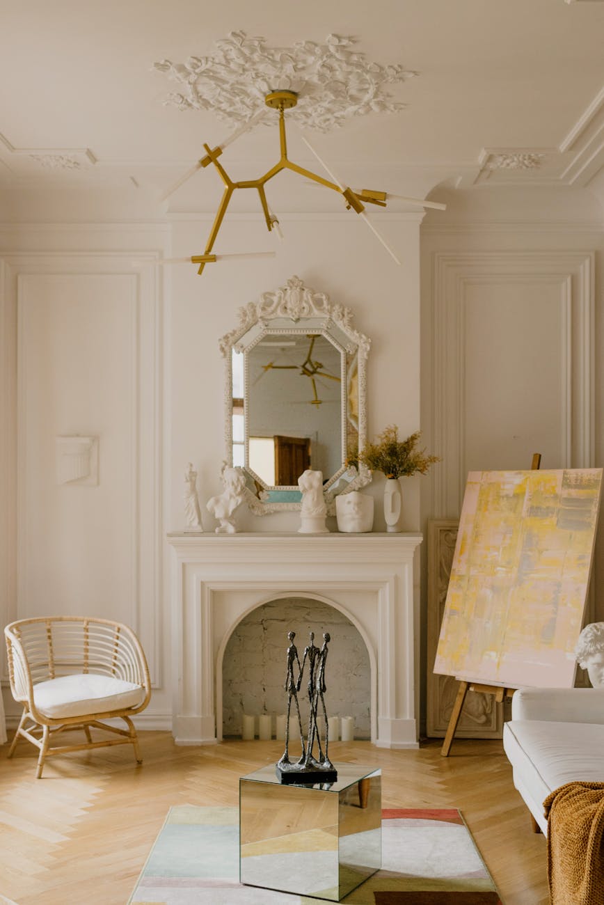
Colour and Design Manager Lauren Treloar notes that vintage design movements are resurfacing, but they are being reinterpreted for modern homes. Instead of recreating a full 1970s lounge room, homeowners are incorporating a single earthy wall, sculptural furniture, or layered textures that nod to the past while staying contemporary. The result feels curated rather than themed.
Colour Drenching vs Colour Capping
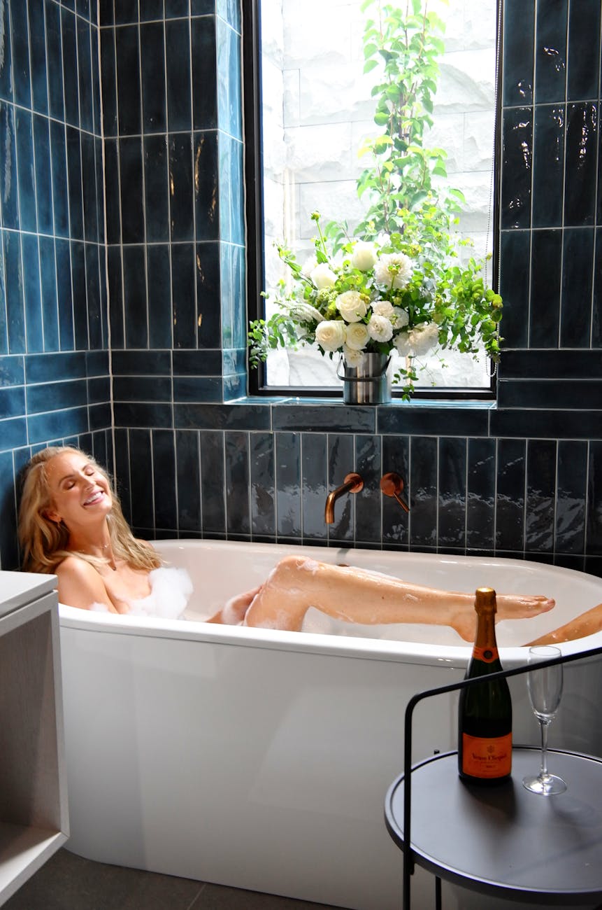
One of the biggest styling conversations this season is how to use colour with intention. Colour drenching, painting walls, trims, and sometimes ceilings in the same shade, creates a rich, enveloping mood. It is particularly effective with deeper tones like chocolate, warm gold, or deep aqua.
Colour capping, where ceilings or upper sections are painted in a contrasting or complementary shade, can subtly reshape a room’s proportions and add architectural interest. Both approaches allow homeowners to express personal style without clutter.
Texture Is Just as Important as Colour
Warmth is not only about hue. It is about finish and layering.
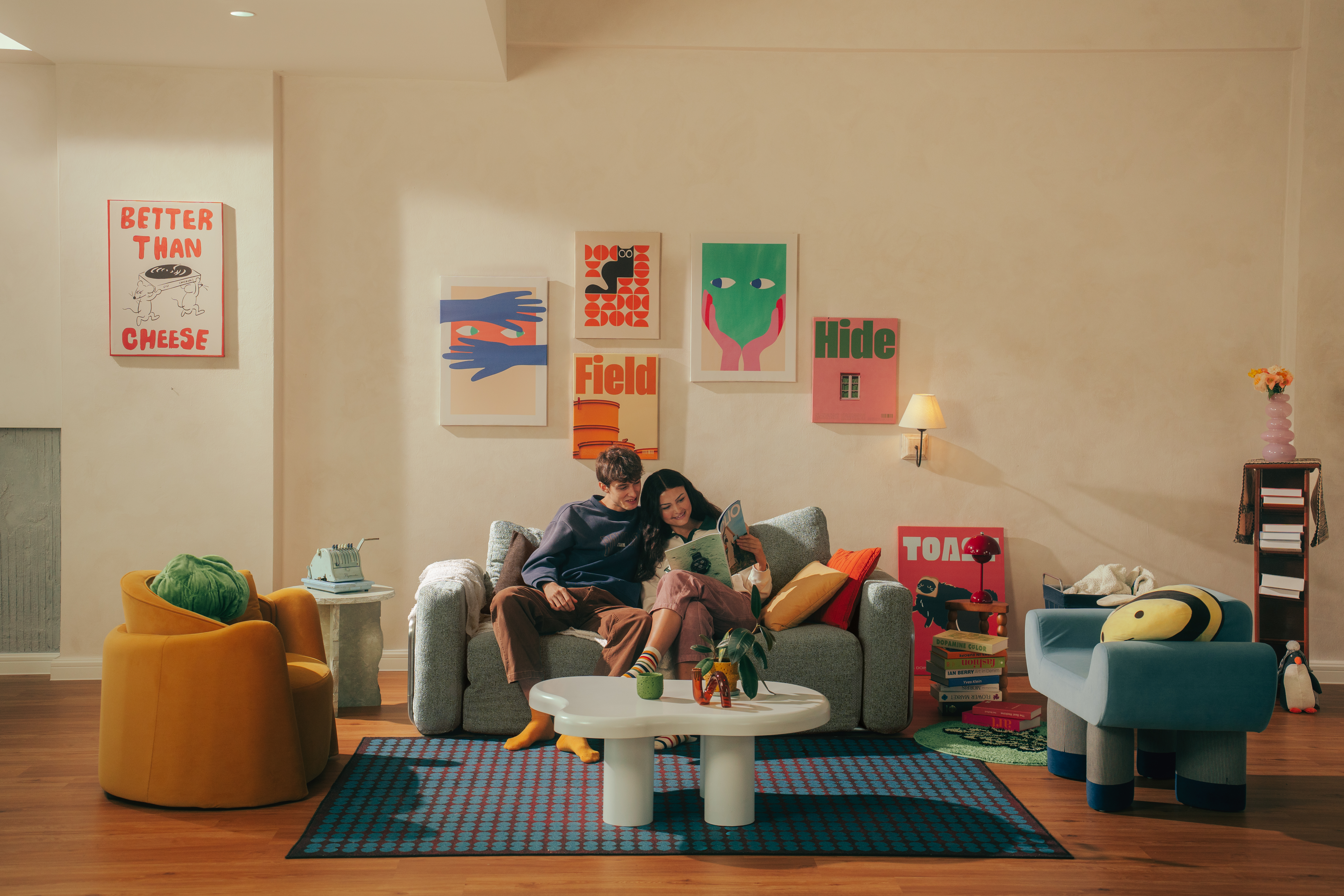
This season is all about organic shapes and tactile surfaces. Think curved furniture, boucle upholstery, ceramic lamps, woven rugs, and matte finishes. When paired with rich earthy tones like Dulux Chocolate Treat or muted pinks such as Dulux Baked Clay, these textures create depth and softness.
Layering different finishes, matte walls, velvet cushions, brushed brass accents, timber flooring, builds comfort visually and physically. The overall effect is calm, cosy, and deeply personal.

How to Bring the Trend Into Your Own Home
You do not need a full renovation to embrace nostalgic interiors.
Start small:
- Paint a feature wall in a warm gold or dusty pink
- Introduce burnt orange or deep aqua through soft furnishings
- Add curved mirrors or sculptural side tables
- Layer throws and cushions in tonal variations
If you are ready to go further, consider colour drenching a smaller room such as a study or powder room for dramatic impact.
The beauty of this trend is that it invites experimentation. It is expressive, comforting, and far removed from the cool minimalism that has dominated for years.
As winter sets in, homes across Australia are becoming richer, warmer, and more emotionally layered. Nostalgia is not about looking backwards. It is about creating spaces that feel grounding and personal in the present.
And this season, colour is leading the way.

For more inspiration visit Dulux here.

Leave a Reply