
Choosing paint colours should be one of the most exciting parts of decorating a home. In reality, it can feel completely overwhelming. One shade of white looks yellow. Another looks grey. The colour you loved on Pinterest suddenly feels too dark on your wall. A soft beige turns pink in afternoon light. A rich green looks beautiful in the sample pot but strangely heavy once it is painted across an entire room.
Paint is powerful because it changes more than the look of a room. It changes how a space feels. The right colour can make a bedroom feel restful, a kitchen feel warmer, a living room feel more layered and a hallway feel more intentional. The wrong colour can make even beautiful furniture, lighting and decor feel slightly off.
The good news is that choosing paint colours becomes much easier once you understand a few simple principles. Light, undertones, room function, flooring, furniture, ceiling colour and paint finish all matter. Once you know how they work together, colour feels less intimidating and much more intuitive.
This is your complete guide to choosing paint colours for every room in your home.
Why Paint Colours Look Different in Every Home
One of the biggest mistakes people make when choosing paint is assuming a colour will look the same in their home as it does online, in a magazine or on someone else’s walls.
Paint changes depending on:
Natural light
Artificial light
The direction the room faces
The size of the room
Ceiling height
Flooring
Existing furniture
Window treatments
Nearby colours
The finish of the paint
This is why a warm white can look creamy and soft in one home, but too yellow in another. A grey can look elegant in a bright room, but cold and flat in a darker one. A beige can look calm in the morning and slightly peach by sunset.
Paint is never seen in isolation. It is always responding to the space around it.
Before choosing any colour, look at your room as a whole. What is already staying? The flooring, tiles, stone, cabinetry, sofa, curtains and large rugs will all influence how your paint colour reads.
If you are starting from scratch, paint can lead the scheme. If you are decorating around existing pieces, paint should support what is already there.
Start With the Feeling You Want
Before you look at paint cards, think about the mood you want the room to have. Do you want it to feel calm? Fresh? Cosy? Elegant? Bright? Moody? Warm? Coastal? Classic? Playful?
A beautiful colour is not always the right colour. The best paint choice is the one that supports the way you want to live in the space.
For a calm room, look at soft neutrals, warm whites, muted greens, powder blues, gentle taupes and earthy beiges. For a cosy room, try clay, mushroom, olive, chocolate, warm beige, dusty rose or deep blue.
For a fresh room, consider clean whites, pale blues, soft greens, warm off whites and light natural neutrals. For a dramatic room, look at burgundy, aubergine, charcoal, deep green, navy, plum or rich brown.
For a timeless room, choose warm whites, stone, soft taupe, muted sage, linen tones and classic neutrals.
This is why colour trend articles can be helpful, but they should never be followed blindly. Use trends for inspiration, then choose the shade that suits your home, your light and your lifestyle. Our guide to Milan Design Week colour trends and the earthy interior palette defining 2026 homes is a useful place to start if you love warm, layered, natural interiors.
Understand Warm and Cool Undertones
Undertones are the hidden colours that sit beneath a paint shade. They are the reason two whites can look completely different once they are on the wall.
Warm undertones include yellow, cream, peach, pink, red and brown.
Cool undertones include blue, grey, green and violet.
Neutral undertones sit somewhere in the middle, although most colours still lean slightly warm or cool.
A warm white can make a room feel soft and welcoming. A cool white can feel crisp and modern. A beige with a pink undertone can look elegant in one room but too rosy in another. A grey with a blue undertone can feel clean in bright light but cold in a shaded room.
The easiest way to understand undertones is to place similar colours next to each other. If you hold three white paint swatches together, you will quickly see that one looks creamy, one looks grey and one looks slightly green. That difference is the undertone.
Undertones matter because they need to work with the fixed elements in the room. Warm timber floors usually work well with warm whites, soft beiges, olive, clay and muted greens. Cool grey tiles often work better with cooler whites, blue based greys, soft charcoals and cleaner neutrals. Cream stone needs a different white from bright white marble. Terracotta tiles love warm neutrals, soft pinks, olive greens and earthy tones. Black and white checkerboard floors can handle stronger contrast and crisp trim.
The colour of your walls should not fight the colour of your floors, tiles or major furniture pieces. It should make them look intentional.

How Natural Light Changes Paint Colour
Natural light is one of the most important factors when choosing paint. A north facing room in Australia usually receives strong, direct light and can handle cooler or deeper colours more easily. Warm colours may become more intense in this light.
A south facing room often receives softer, cooler light. Warm whites, soft creams, beige, muted pinks and gentle earthy tones can help prevent the room from feeling cold.
An east facing room gets bright morning light and cooler afternoon light. Colours can look fresh early in the day and more muted later.
A west facing room receives warm afternoon and evening light. Creams, beiges, pinks, yellows and warm neutrals can become stronger as the day goes on.
This is why sample testing is essential. A colour that looks perfect at 10am may look completely different at 5pm.
Paint large sample patches on at least two walls and look at them throughout the day. Do not judge a colour from a tiny swatch or from a sample painted on one wall only.
How Artificial Light Affects Paint
Artificial lighting can change paint dramatically, especially in bedrooms, kitchens, bathrooms and living rooms used mostly at night.
Warm bulbs can make whites look creamier and bring out yellow, pink or red undertones.
Cool bulbs can make colours look sharper, greyer or bluer.
Downlights can create shadows that make darker colours feel heavier.
Lamps usually create a softer, more flattering effect.
Before committing to a paint colour, look at it with your lights on in the evening. This is especially important in rooms you use after dark, such as bedrooms, dining rooms and living spaces.
If your paint looks beautiful in daylight but strange at night, you may need to change the light bulbs rather than the paint. Lighting and colour always work together.
For more ideas on creating atmosphere through finishing touches, our guide to 12 ways to make your home feel instantly more luxurious is a great companion piece.
Should You Choose Paint or Furniture First?
If you already own major furniture pieces, choose paint around them.
Your sofa, rug, bedhead, dining table, cabinetry and curtains have a much bigger visual impact than small decor pieces. It is easier to find a paint colour that works with a sofa than to replace a sofa because the paint feels wrong.
If you are renovating or decorating a room from scratch, start with the fixed and expensive items first.
Flooring
Stone
Tiles
Cabinetry
Large rugs
Sofas
Curtains
Major artwork
Then choose paint.
Paint is one of the easiest and most affordable things to change, but it is also one of the most visually powerful. It should bring the room together, not be chosen in isolation.
How to Choose White Paint
White paint sounds simple, but it is one of the hardest colours to get right.
There are bright whites, warm whites, cool whites, creamy whites, grey whites, chalky whites and whites with green, yellow, pink or blue undertones.
A bright white can look fresh and architectural in a sunny room, but stark in a darker space.
A warm white can feel soft and inviting, but too creamy if paired with cooler finishes.
A cool white can look clean and modern, but cold if the room does not receive enough natural light.
A slightly muted white is often the most forgiving choice for real homes because it softens the room without looking too yellow or too grey.
White paint works best when it relates to the rest of the palette. If your home has warm timber, natural linen, brass and cream stone, a warm white will usually feel more harmonious. If your home has black accents, cool stone, chrome and crisp architectural lines, a cleaner white may work better.
White also looks different depending on what sits next to it. Against dark floors, it can feel crisp. Against cream tiles, it may look too stark. Against colourful art, it can feel fresh and gallery like.
When in doubt, avoid the brightest white on the card. A slightly softened white is often easier to live with.

Best Paint Colours for Living Rooms
Living rooms need to feel comfortable, welcoming and flexible. They are often used during the day and at night, which means the paint colour needs to work in changing light.
The best living room paint colours include:
Warm white
Soft beige
Stone
Taupe
Muted sage
Olive
Clay
Mushroom
Pale greige
Powder blue
Warm grey
Soft terracotta
Deep green
Chocolate brown
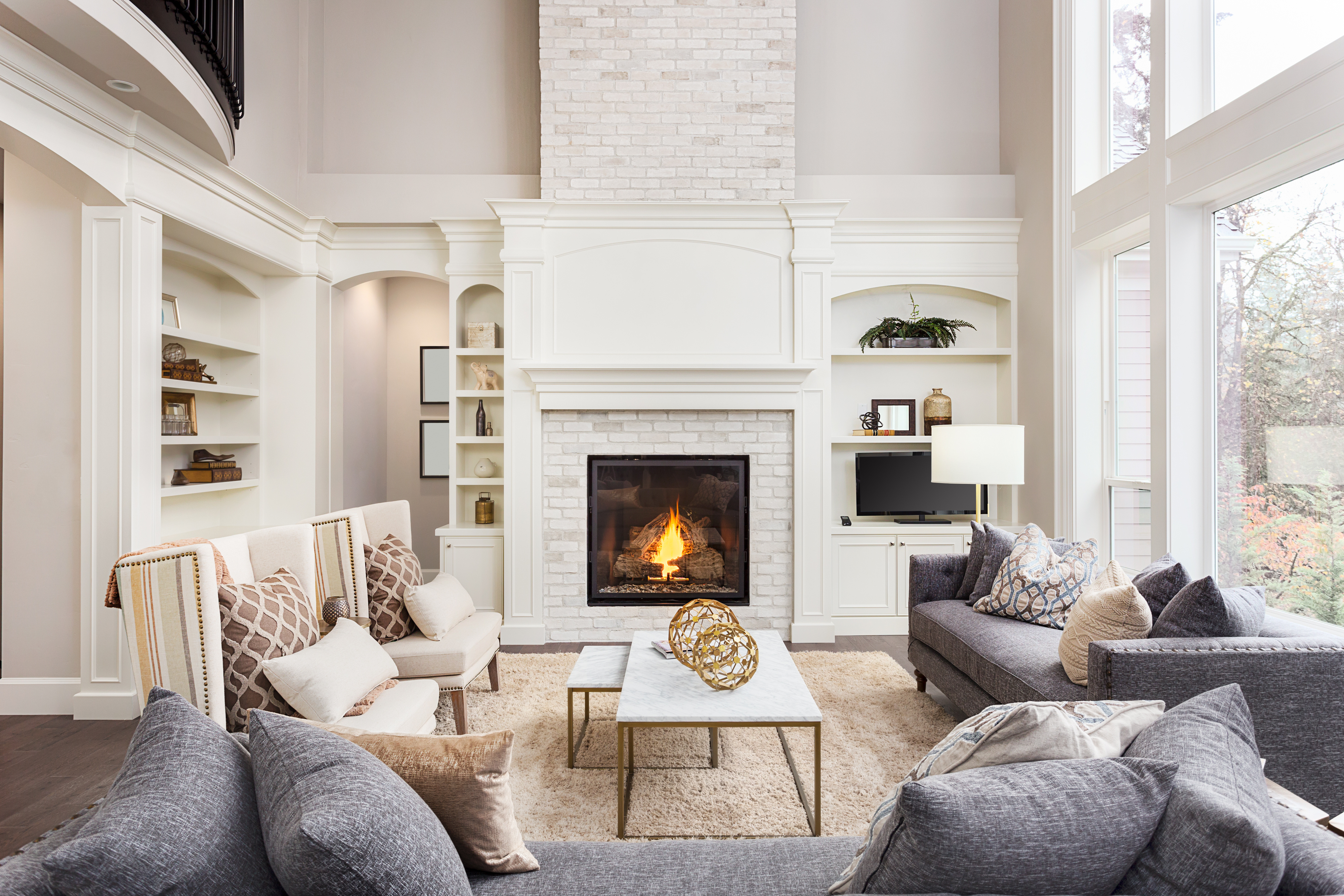
For a classic living room, choose a warm white or soft neutral and add depth through furniture, art, rugs and cushions.
For a cosy living room, try mushroom, olive, clay or warm taupe. These colours feel grounded without being too dark.
For a more dramatic living room, deep green, chocolate, navy or burgundy can be beautiful, especially with warm lighting, textured fabrics and natural materials.
If your living room is small, do not assume it must be white. A soft mid tone can sometimes make a small room feel more complete and inviting than a pale colour. The key is to keep the palette cohesive.
Best Paint Colours for Bedrooms
Bedrooms should feel restful, personal and cocooning. This is where softer, quieter colours often work beautifully.
The best bedroom paint colours include:
Warm white
Soft cream
Dusty pink
Muted sage
Olive
Mushroom
Clay
Stone
Soft taupe
Pale blue
Smoky blue
Plum
Deep green
Chocolate
Warm beige
If you want a calm bedroom, look for colours with a little softness and depth. Very bright colours can feel too energising, while stark white can sometimes feel unfinished.
Muted greens are excellent for bedrooms because they feel connected to nature. Soft blue can feel peaceful and airy. Warm neutrals create a relaxed hotel style mood. Dusty pink, clay and mushroom tones can feel warm without being overly sweet.
For a more intimate bedroom, consider painting the walls and ceiling in the same colour. This creates a wrapped, cocoon like feeling that works especially well in deeper shades.
Best Paint Colours for Kitchens
Kitchens have many fixed elements, so paint needs to work with cabinetry, benchtops, splashbacks, flooring and appliances.
The best kitchen paint colours include:
Warm white
Soft stone
Taupe
Mushroom
Sage green
Olive
Cream
Pale blue
Charcoal
Deep green
Navy
Clay
Greige
If your cabinetry is white, wall colour can add softness and depth. Warm white, beige, sage, pale blue or mushroom can stop the space feeling too stark.
If your cabinetry is timber, consider warm neutrals, soft greens, clay or muted cream. These tones usually work beautifully with natural grain.
If your kitchen has stone with strong veining, choose a wall colour that picks up one of the softer tones in the stone rather than competing with it.
If your splashback is colourful or patterned, keep the walls quieter.
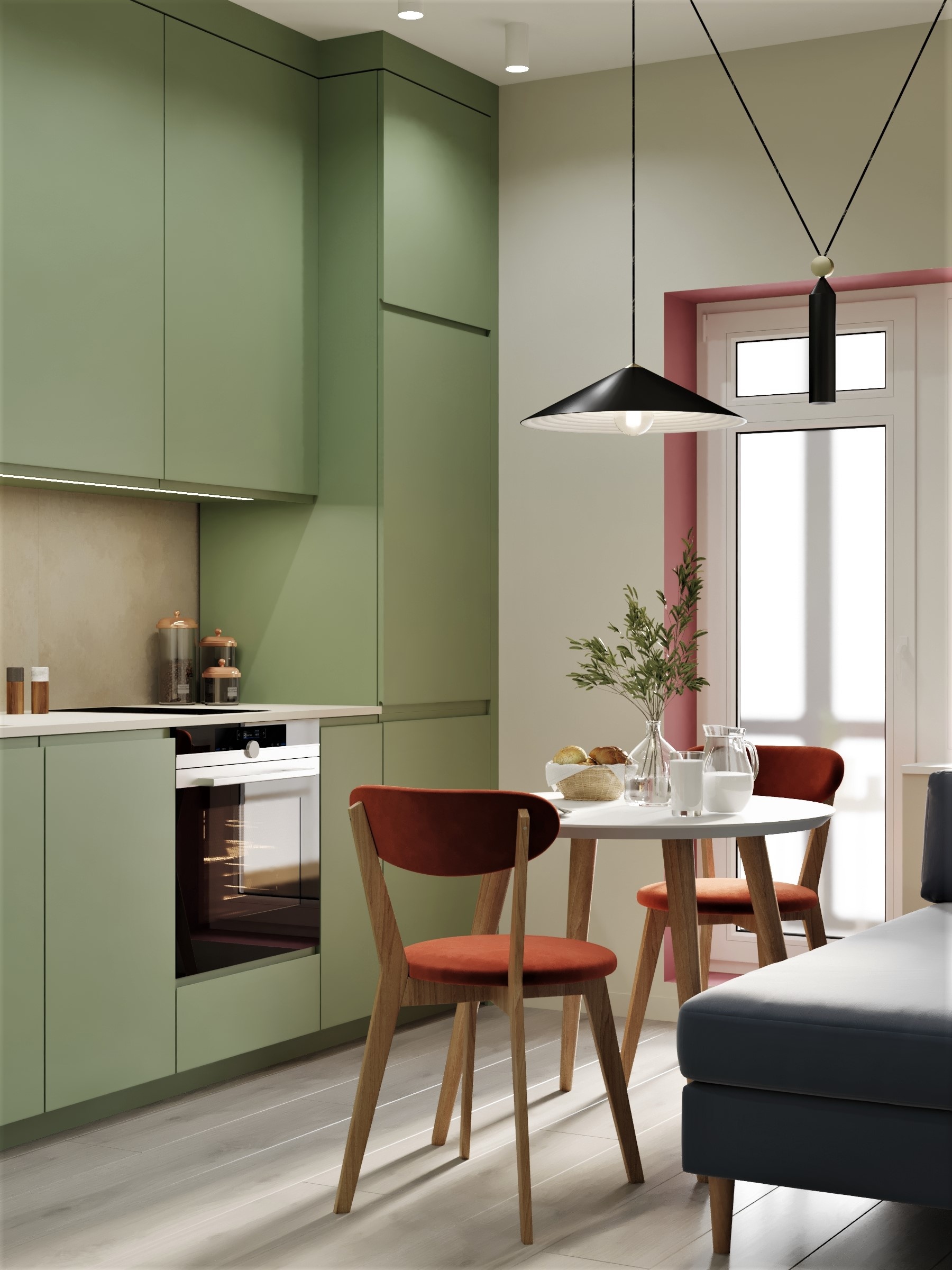
Painted cabinetry can also be a beautiful option if you want to refresh a kitchen without a full renovation. Sage, olive, deep blue, mushroom, soft grey and warm cream all have long term appeal.
For more kitchen styling ideas with a relaxed holiday mood, you may also enjoy this piece on bringing holiday vibes to your home kitchen on eat.live.escape.
Best Paint Colours for Bathrooms
Bathrooms are often filled with hard surfaces, tiles, mirrors, glass, stone and metal. Paint can help soften all of this and make the space feel warmer.
The best bathroom paint colours include:
Warm white
Soft beige
Pale stone
Powder blue
Sage green
Olive
Clay
Blush
Warm grey
Charcoal
Deep green
Soft terracotta
White bathrooms can look beautiful, but they need warmth through texture, lighting and materials. If a bathroom feels cold, try a warmer wall colour rather than adding more white.
Powder blue can feel fresh and spa like. Sage and olive bring a natural feeling. Clay and beige work beautifully with stone, timber and brushed metals.
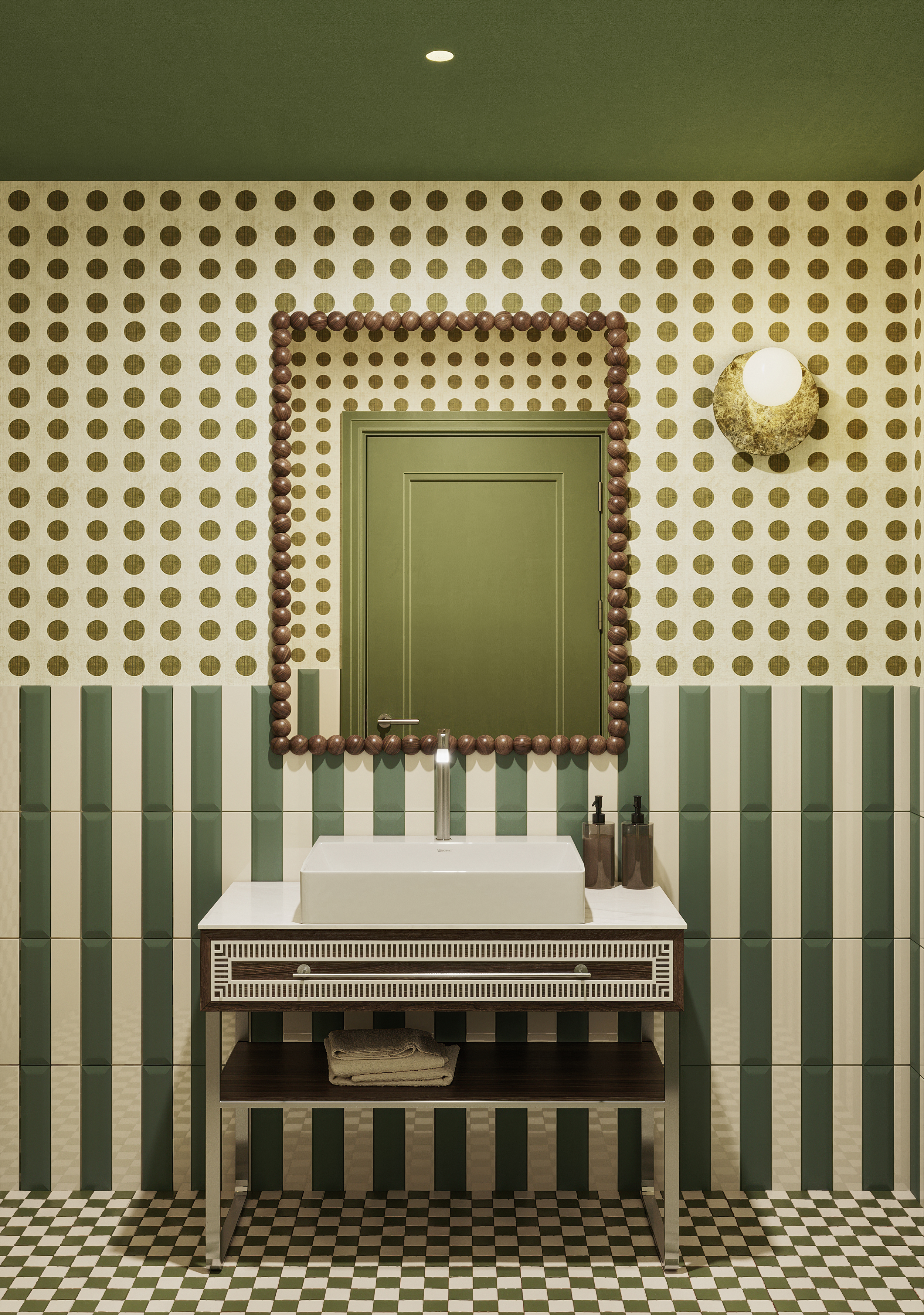
For small powder rooms, do not be afraid of deeper colours. A rich green, burgundy, chocolate or charcoal can turn a small space into one of the most memorable rooms in the home.
If you love a calm, restorative bathroom, read our guide to spa bathroom ideas and how to create a wellness bathroom at home.
Best Paint Colours for Dining Rooms
Dining rooms can handle more mood and personality than many other spaces. They are often used in the evening, which means deeper colours can feel especially beautiful by candlelight or warm lamps.
The best dining room paint colours include:
Burgundy
Aubergine
Chocolate
Deep green
Navy
Olive
Terracotta
Clay
Warm beige
Soft taupe
Charcoal
Plaster pink
If you want your dining space to feel intimate, choose a deeper colour and pair it with warm lighting. If you want it to feel relaxed and Mediterranean, consider clay, terracotta, warm white or olive.
Dining rooms are also a great place to use colour drenching, where walls, trim and sometimes ceilings are painted in the same or similar shades. For more inspiration, read our guide to colour drenching vs colour capping and which interior trend suits your space.
Best Paint Colours for Hallways
Hallways are often overlooked, but they set the tone for the whole home. They also connect rooms, which means the paint colour should create flow.
The best hallway paint colours include:
Warm white
Stone
Soft beige
Greige
Pale taupe
Muted sage
Soft grey
Clay
Mushroom
Deep olive
Charcoal
If your hallway is dark, avoid assuming white is the only answer. In a space without much natural light, white can sometimes look flat or shadowy. A soft neutral with warmth may feel better.
If your hallway is narrow, painting the walls, trim and doors in a similar tone can reduce visual clutter.
If your hallway has beautiful architectural details, paint can highlight them. A deeper wall colour with lighter trim feels classic, while one colour across walls and trim feels more modern.
Hallways are also a lovely place to use art, mirrors and lamps. The paint colour should make those pieces feel considered.
Best Paint Colours for Home Offices
A home office needs to support focus, creativity and comfort. The right colour depends on the type of work you do and the mood you need.
The best home office paint colours include:
Soft green
Olive
Warm white
Stone
Mushroom
Taupe
Deep blue
Charcoal
Muted terracotta
Clay
Warm beige
Green is a strong choice for workspaces because it feels calm and grounded. Blue can help a room feel focused and structured. Warm neutrals are good if you want a flexible background for video calls.
Avoid colours that feel too visually loud unless you know they energise you. Bright red, strong yellow or very saturated orange may feel exciting at first but tiring over time.
If your office is part of another room, use paint to define the zone. Even a painted nook or tonal wall behind the desk can make the workspace feel more intentional.

Best Paint Colours for Children’s Rooms
Children’s rooms do not need to be overly bright to feel playful. In fact, softer colours often age better and make the room easier to update as children grow.
The best children’s room paint colours include:
Soft blue
Sage green
Warm white
Butter yellow
Dusty pink
Clay
Lavender
Muted mint
Powder blue
Soft peach
Warm beige
If you want colour, consider using it in a gentle, liveable way. A soft blue ceiling, sage green walls, dusty pink trim or warm yellow door can feel playful without overwhelming the space.
For longevity, keep the wall colour relatively calm and add bolder personality through bedding, art, rugs, toys and decor.
This makes the room easier to change over time without repainting every few years.

Should You Paint the Ceiling?
The ceiling is often called the fifth wall for a reason. It can completely change how a room feels.
A white ceiling keeps a room feeling open and classic.
A ceiling painted in the same colour as the walls creates a soft, enveloping effect.
A slightly lighter version of the wall colour can feel subtle and elegant.
A bold ceiling can add drama, especially in dining rooms, bedrooms, powder rooms and children’s spaces.
A dark ceiling can make a room feel intimate, but it works best when the rest of the design is carefully balanced.
If you want your home to feel more designed, ceilings are worth considering. They are especially effective in rooms with high ceilings, decorative cornices or awkward proportions.
For more inspiration, read our piece on statement ceiling ideas and why designers are looking up in 2026.
Should Skirting Boards and Doors Be White?
Not always.
White trim is classic, but it is not the only option. In some homes, bright white skirting boards and doors can create too much contrast, especially if the walls are warm or muted.
You can paint trim:
Bright white for crisp contrast
Warm white for a softer classic look
The same colour as the walls for a modern feel
A slightly darker tone for depth
A contrasting colour for personality
Painting trim the same colour as the walls can make a room feel calmer and more elevated. It also works well in smaller rooms because it reduces visual interruption.
In heritage homes, contrast trim can highlight architectural details beautifully. In modern homes, tonal trim often feels cleaner.
There is no one rule. The right choice depends on the style of the home and the feeling you want.
Matte, Low Sheen, Satin or Gloss?
Paint finish matters as much as colour.
Matte paint has a soft, velvety look and hides imperfections well. It is beautiful in bedrooms, living rooms and low traffic spaces, but may be less washable depending on the product.
Low sheen paint has a gentle finish and is often a practical choice for walls in everyday spaces.
Satin paint has a little more durability and can work well in kitchens, bathrooms, laundries, doors and trim.
Semi gloss and gloss finishes reflect more light and are often used on doors, trims, cabinetry and feature details.
For most homes, a low sheen or washable matte on walls is a safe choice. Use more durable finishes in high traffic areas and wet zones.
Gloss is making a return in interiors, but it works best when used intentionally. A glossy door, painted cabinet, ceiling or trim can look beautiful, but full gloss walls are less forgiving and need excellent preparation.
How to Test Paint Properly
Never choose paint from a tiny swatch alone.
The best way to test paint is to paint large sample patches on the wall or on movable sample boards. Look at the colour in different parts of the room and at different times of day.
Test it next to:
Flooring
Curtains
Cabinetry
Stone
Tiles
Sofas
Artwork
Bedding
Rugs
Do not rush the decision. Live with the samples for a few days if possible.
Look at them in morning light, afternoon light and evening light. Turn lamps and downlights on. Check the colour on sunny days and cloudy days.
A paint colour that still looks good across changing light is usually a strong choice.
Common Paint Colour Mistakes to Avoid
Choosing colour from a screen only
Ignoring undertones
Testing one tiny swatch
Forgetting about flooring
Using a bright white in a dark room
Choosing grey without checking if it turns blue
Painting before choosing key furniture
Ignoring artificial lighting
Choosing every room separately with no flow
Following trends without considering the home
Using too many feature walls
Forgetting about the ceiling
Choosing a colour because it worked in someone else’s house
The biggest mistake is choosing paint too quickly. Paint is changeable, but repainting still takes time, effort and money. A few extra days of testing can save a lot of regret.
How to Create Flow Between Rooms
A home feels more beautiful when the colours relate to each other.
This does not mean every room needs to be the same colour. It means the palette should have a sense of connection.
You might choose one warm white for the main spaces, then use deeper related tones in bedrooms, bathrooms or dining rooms.
You might create a palette of warm beige, olive, clay and cream.
You might use soft blue, white, stone and warm timber throughout.
You might keep the walls neutral and repeat colour through artwork, cushions, lamps and decor.
The key is repetition. A colour that appears in one room should ideally echo somewhere else, even in a small way.
If the living room has olive cushions, an olive toned bathroom wall or artwork in the hallway can create subtle flow. If the bedroom is dusty pink, a similar tone in a dining room artwork or floral arrangement can make the home feel connected.
How to Choose a Whole Home Paint Palette
For a whole home palette, start with three to five colours.
A main neutral for living areas and hallways
A trim colour
One or two accent colours
One deeper shade for mood or contrast
For example:
Warm white walls
Soft white trim
Olive accents
Clay bedroom
Chocolate powder room
Or:
Stone walls
Warm white trim
Sage cabinetry
Powder blue bathroom
Deep green dining room
Or:
Cream walls
Tonal cream trim
Terracotta accents
Dusty rose bedroom
Aubergine study
The goal is not to make every room match. The goal is to make the home feel considered.
If you are nervous about colour, start with a warm neutral base and introduce stronger shades in smaller rooms. Powder rooms, laundries, studies, hallways and bedrooms are all good places to experiment.
The Best Paint Colours for Different Interior Styles
Modern Australian
Warm white, soft beige, stone, olive, clay, muted green, chocolate and natural timber tones.
Coastal
Soft white, warm white, sand, pale blue, sage, stone and soft grey.
For a deeper take on relaxed coastal style, read Creating a Beautiful Coastal Inspired Home on eat.live.escape.
Mediterranean
Warm white, terracotta, clay, olive, plaster pink, ochre, deep blue and sun washed neutrals.
Our guide to Amalfi Coast inspired interiors and how to bring La Dolce Vita into your home explores this look beautifully.
Classic
Warm white, cream, taupe, navy, charcoal, sage, soft blue and deep green.
Minimalist
Soft white, stone, greige, warm grey, mushroom and muted beige.
Heritage
Deep green, burgundy, cream, warm white, navy, olive, chocolate and rich taupe.
Contemporary
Crisp white, warm grey, mushroom, charcoal, clay, deep brown and muted green.

How to Use Colour Without Overwhelming a Room
If you love colour but feel nervous about painting an entire room, start small.
Try colour on:
A powder room
A bedroom wall
A ceiling
A door
Cabinetry
A hallway
A laundry
Built in shelving
Window trim
A fireplace wall
You can also use tonal colour rather than bold contrast. For example, instead of a bright green, choose olive. Instead of hot pink, choose dusty rose. Instead of orange, choose clay. Instead of bright blue, choose smoky blue or powder blue.
Muted colours are easier to live with because they have softness and complexity. They add personality without feeling loud.
Paint Colours That Make a Room Feel Bigger
To make a room feel bigger, choose colours that reduce contrast and create flow.
Good options include:
Warm white
Soft beige
Pale stone
Light greige
Soft sage
Powder blue
Warm off white
Paint walls and trim in similar tones so the eye moves around the room without interruption. Use curtains close to the wall colour. Choose furniture that does not create too many heavy visual blocks.
But remember, making a room feel bigger is not always the goal. Sometimes a small room feels better when it is embraced as cosy, intimate and atmospheric.
A tiny white room can feel bare. A tiny olive, clay or chocolate room can feel intentional and beautiful.
Paint Colours That Make a Room Feel Warmer
If a room feels cold, look for colours with warm undertones.
Try:
Cream
Warm white
Beige
Clay
Terracotta
Mushroom
Taupe
Dusty pink
Olive
Chocolate
Caramel
Ochre
Warm colours are especially helpful in rooms with cool natural light, grey flooring, white tiles or a lot of glass and metal.
Texture also matters. Warm paint will feel even better with linen curtains, wool rugs, timber furniture, ceramic lamps and soft lighting.
Paint Colours That Make a Room Feel Calmer
For a calmer room, avoid colours that are too bright, too sharp or too high contrast.
Try:
Soft green
Sage
Warm white
Stone
Mushroom
Pale blue
Dusty pink
Soft taupe
Muted clay
Warm beige
Calm rooms usually work best when the palette is soft, layered and not overly busy. Paint is only one part of that, but it sets the foundation.
For more ideas on creating a gentle, restorative home, pair your paint decisions with good lighting, natural texture, storage and meaningful objects.
The Final Word on Choosing Paint Colours
Choosing paint colours is not about finding one perfect shade that works everywhere. It is about understanding your home, your light and the feeling you want to create.
Start with the room’s purpose. Look at the natural light. Check the undertones in your flooring, furniture and finishes. Test large samples. View them across the day. Think about how each room connects to the next.
The best paint colours are not always the most dramatic or the most fashionable. They are the ones that make your home feel more like itself.
A warm white can be transformative. A soft green can change the mood of a bedroom. A clay toned dining room can make every dinner feel more intimate. A powder blue bathroom can feel fresh and peaceful. A deep burgundy study can feel rich and cocooning.
Paint is one of the simplest ways to change a home, but when chosen well, it can also be one of the most powerful.
FAQs
What is the best paint colour for a living room?
Warm white, soft beige, stone, taupe, muted sage and warm greige are all excellent living room paint colours. For a moodier look, deep green, chocolate, navy or burgundy can also work beautifully.
What paint colours make a room look bigger?
Soft whites, warm neutrals, pale stone, light greige and gentle sage can help a room feel bigger. Keeping the walls, trim and curtains in similar tones can also reduce visual clutter.
What is the most timeless interior paint colour?
Warm white is one of the most timeless interior paint colours because it works with many styles. Soft beige, stone, taupe, sage and muted neutrals also have long term appeal.
Should every room in the house be the same colour?
No. Every room does not need to be the same colour, but the colours should relate to each other. A whole home palette helps create flow while still allowing each room to have its own mood.
How do I know if a paint colour has warm or cool undertones?
Compare it with similar colours. Warm undertones may look yellow, cream, pink, peach or brown. Cool undertones may look blue, grey, green or violet. Always test colours next to your flooring, furniture and tiles.
Should ceilings always be white?
No. White ceilings are classic, but coloured ceilings can add depth and atmosphere. Painting the ceiling the same colour as the walls can make a bedroom, dining room or powder room feel more cocooning.
What paint finish is best for interior walls?
Low sheen or washable matte finishes are usually good choices for interior walls. Bathrooms, kitchens and high traffic areas may need a more durable finish.
How many paint colours should you use in a home?
A simple whole home palette usually includes three to five colours, including a main wall colour, trim colour, one or two accent colours and a deeper shade for contrast.
Why does my paint colour look different at night?
Artificial lighting changes how paint appears. Warm bulbs can make colours look creamier or yellower, while cool bulbs can make them look greyer or bluer. Always check samples at night before committing.
Is grey paint still in style?
Grey can still look beautiful, but cooler greys are being replaced by warmer neutrals such as stone, mushroom, taupe, beige and greige. If you love grey, choose one with warmth so it feels softer and more current.
Where to Next
For more colour inspiration, read Milan Design Week Colour Trends: The Earthy Interior Palette Defining 2026 Homes.
If you are thinking about using deeper colour, read Colour Drenching vs Colour Capping: Which Interior Trend Suits Your Space?.
For a fresh take on overhead colour, read Statement Ceiling Ideas: Why Designers Are Looking Up in 2026.
To make your finished space feel more polished, read 12 Ways to Make Your Home Feel Instantly More Luxurious.
For a softer, fashion inspired approach to colour, visit eleSTYLED and read How to Wear White for Every Skin Tone.


Leave a Reply