
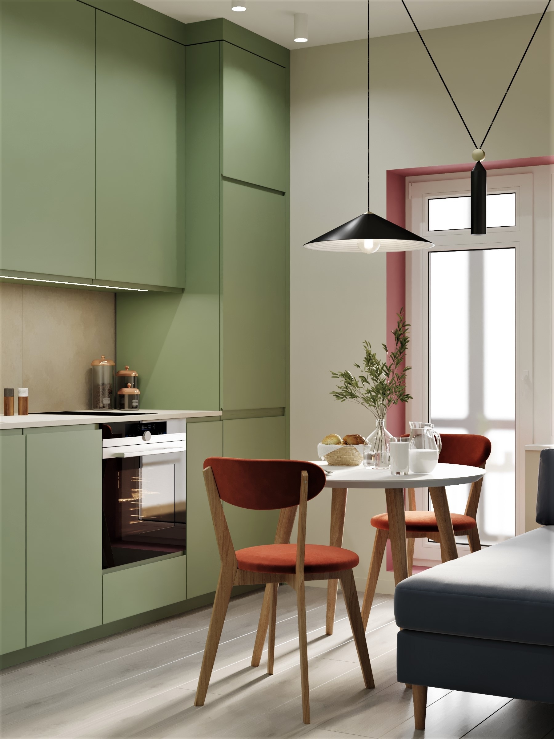
A green kitchen has an unusual ability to feel settled from the moment it is installed. The colour can make newly built cabinetry seem familiar, soften the hard geometry of an island and give pale stone a more substantial neighbour. Depending on its undertone, green can suggest a country kitchen, a compact city apartment or a sharply contemporary home without belonging exclusively to any of them.
That flexibility explains why green kitchens deserve consideration beyond the life of a decorating trend. In a kitchen, this range is especially useful: cabinetry occupies a large visual area, yet must live comfortably with timber, appliances, metal fittings and the rooms around it.
Calling green a modern classic is an editorial judgement about its adaptability, rather than a promise that every green finish will age well. The enduring kitchen is the one whose colour belongs to its light, architecture and daily routines. A convincing scheme begins with those relationships, then gives the green enough room to become part of the house.
Why green kitchens feel at home in so many settings
Green offers a broad middle ground between a neutral kitchen and a highly saturated one. A greyed sage can behave almost like a neutral, while olive introduces a warmer, earthier character. Forest green creates stronger definition, particularly alongside a light worktop. Each has a different effect on the apparent weight of cabinetry and the atmosphere of an open-plan room.
There is also a useful relationship with the view beyond a window. Green cabinetry can echo foliage without literally copying it. In an urban home with little garden outlook, it can still create a pleasing connection with timber, woven textures and stone. That material conversation is more durable than a scheme built around a single fashionable shade.
The modern kitchen increasingly participates in the home’s living spaces. Salone del Mobile’s account of EuroCucina 2026 describes kitchens through their expressive surfaces and their relationship with contemporary life. Green suits that broader role because it can read as furniture colour, allowing a cabinet run to sit beside bookshelves, dining chairs and upholstered seating with ease.
Choose the green after considering the room
Before falling for a paint sample, look at the fixed finishes. A creamy floor, a cool grey worktop and red-toned timber each alter how green appears. In strong daylight, a yellow-based olive may look lively; under warm lamps it may become considerably more golden. A blue-based green can feel sharper beside warm oak than beside white marble.
Build a sample board with the actual cabinet finish, worktop, splashback and handle. View it vertically and horizontally because light falls differently on each plane. Leave it in the kitchen for several days and consider it from the adjacent living area. Our complete paint-colour guide is helpful when sorting out the undertones before the larger decisions begin.
Sage, olive and forest green have different jobs
Sage works well when the aim is a gentle transition from a pale room. Its grey component can make cabinetry feel quieter, although a very cool sage may need timber or warmer textiles nearby. Olive is particularly compelling with natural oak, off-white walls and dark bronze accents. Its warmth can feel grounded without making the kitchen heavy.
Forest green creates a more architectural presence. Use it where you want the cabinetry to read as a strong volume, then balance it with the room’s light and the scale of the island. A deep green does not require every surrounding surface to be white. Soft stone, muted plaster and a pale timber floor can give it a more layered setting.
The cabinet profile matters as much as the colour
Simple framed doors give green a familiar, furniture-like character. Keep the framing in proportion to the size of the fronts; an elaborate profile on narrow drawers can become busy. In a period home, modest detailing can relate to existing doors and skirtings without recreating an entire historic kitchen.
Flat-front cabinetry produces a different effect. The green reads as a continuous surface, making accurate alignment, edge details and the finish itself particularly important. A muted colour can soften that precision, while a sharper green makes it more graphic. Neither approach needs decorative additions to establish its identity.
Consider how the style meets the rest of the home. A kitchen should have its own character, but an abrupt change in language at the dining area can make an open plan feel disjointed. Our overview of kitchen styles provides useful references for deciding how much framing, contrast and decorative detail the room can carry.

Pair green cabinetry with materials that give it depth
Oak introduces warmth and a readable grain beside green, particularly in a dining table, shelves or an island detail. Darker walnut creates a richer combination, though the balance needs care in a dim room. Use timber where people see and touch it, then assess whether another large timber surface would add interest or simply repeat the same information.
Stone provides a different kind of variation. A pale worktop with restrained movement lets the cabinetry lead; a more expressive slab can become a second focal point. Place samples together at a realistic size. A tiny piece of strongly veined stone may look quiet on a board but read very differently across a full island.
Let practicality guide the worktop and splashback
Natural stone, engineered surfaces, porcelain and laminate each require different decisions about care, fabrication and cost. Ask the supplier about the exact product’s suitability, cleaning requirements, edge options and heat exposure. A beautiful sample is only part of the specification. Choose a finish whose everyday demands suit the way you cook and clean.
For a splashback, a simple tile can introduce a small change in sheen. Cream against olive feels softer than a very stark white; warm grey may suit a cooler green. Test grout as part of the scheme. Dark lines can make a modest tile unexpectedly graphic, while a closely related grout colour allows its surface variation to do the work.
Metal finishes should support the palette
Brass and green can be a handsome pairing, but the word brass covers a wide range of appearances. A pale brushed finish behaves differently from polished yellow metal or an aged surface. Put the actual handle and tap sample beside the cabinetry before choosing. A strong yellow finish may amplify the warmth of olive more than you expect.
Stainless steel can give a green kitchen a clean, practical edge. It is particularly useful where appliances remain visible and where a highly decorative fitting would feel out of character. Dark metal supplies definition, although too many black outlines can make a gentle palette look more severe. Consider handles, lighting and stools together rather than selecting each independently.
You do not need every metal to match exactly. A dominant finish with a smaller, deliberate second finish can feel natural. The connection should come through the room’s overall balance and the objects’ form. Avoid adding a new finish simply because each individual fitting looked appealing in isolation.

Decide where the green should begin and end
Green on every cabinet creates a strong, unified composition. It can work especially well when the joinery is simple and the worktop provides a calm counterpoint. In a smaller kitchen, continuity can make the storage feel more ordered. The room’s proportions and available light are better guides than a blanket rule about dark colours.
A green island with quieter perimeter cabinetry is another option, particularly when the island acts as a piece of furniture between kitchen and living areas. Make the distinction meaningful. If the island is tiny or the room already has several competing finishes, another colour boundary may add visual fragments without improving the space.
Consider the end panels and the view from the sofa. A green cabinet side may become a substantial surface in the living room even if it barely registers within the kitchen itself. Repeat its undertone quietly in that adjoining space. A textile, a painting or a timber finish can make the two rooms feel related without furnishing them identically.
A green kitchen still needs a good plan
Colour cannot compensate for a cramped route between the sink and cooker, drawers that collide or appliances placed without landing space. Mark out the proposed cabinetry and test the everyday sequence of unloading groceries, preparing food and clearing away. Allow for the actual household, including more than one person using the kitchen at the same time.
For compact rooms, begin with storage and usable worktop. Tall cupboards may be more helpful than a decorative shelf; an extra island may make circulation worse. Our ideas for maximising a small kitchen can help identify the useful priorities before colour decisions dominate the project.
Seating needs similar scrutiny. Check the counter height, the stool’s seat height and the space needed to move behind it. A stool that looks delicate may still have a wide footprint. In a small home, a properly considered breakfast nook can offer a more comfortable alternative to squeezing seats around a narrow island.

Style the kitchen with the restraint of a living room
A green kitchen benefits from a few objects that add material interest: a wooden board, a ceramic jug and a bowl of produce can be enough. Keep the working surfaces useful. Styling becomes more convincing when the objects are part of daily life and their scale suits the expanse of cabinetry around them.
Open shelves deserve a clear purpose. Store regularly used pieces where they are easy to reach, leaving enough room to see the wall behind. An entire collection of small objects can turn a quiet palette into a busy display. Closed storage may be the more generous choice where keeping shelves orderly becomes a constant chore.
Lighting completes the green after sunset. Aim for useful illumination at the worktop and a softer atmosphere around eating areas, with suitable fittings and controls for each job. Look at the sample board beneath the chosen lights before the finish is signed off. The green that survives this ordinary evening test has a better chance of feeling right for years.
Frequently Asked Questions
Are green kitchens a timeless choice?
Green can be enduring because its range suits many materials and architectural styles. Longevity depends on the whole design, including cabinetry, layout and finish quality. A carefully tested sage or olive is likely to feel more settled than a colour selected solely to reproduce a trend photograph.
What worktop colour goes with green kitchen cabinets?
Pale stone, warm off-white and restrained grey can all suit green cabinetry. Timber introduces a warmer effect, while a darker surface creates greater visual weight. Compare full samples with the floor and splashback, and assess the worktop’s care requirements before deciding on its appearance.
Can a small kitchen be painted dark green?
Yes, if the colour works with the light and the rest of the room. A continuous dark cabinet run can look ordered rather than fragmented. Test a large sample and maintain effective task lighting. Layout, worktop space and storage remain more significant to daily comfort than colour alone.
Does green cabinetry have to be paired with brass?
No. Stainless steel, nickel, bronze and dark metal can each work. Brass offers warmth, while steel can give the room a cleaner, more practical character. Choose the actual finish against the cabinet sample, considering visible appliances and light fittings as part of the same composition.
How can I introduce green without replacing my kitchen?
Try a green textile in the dining area, painted walls or a carefully planned splashback change. Existing cabinets may be suitable for refinishing, depending on their construction and condition. Ask about proper preparation and durability. Smaller reversible changes can establish whether the colour belongs in your home.
What to Read Next
For a wider material palette, explore 7 Easy Rules for Mixing Wood Tones.
To consider colour beyond the kitchen, read Colour Drenching vs Colour Capping.
For a useful approach to the finishing details, continue with How to Style Open Shelving Without It Looking Cluttered.

Leave a Reply