Summer in the Southern Hemisphere is the perfect season to embrace boldness, and this year Wattyl has teamed up with the talented team at Fenton & Fenton to show just how transformative colour can be. Together, they’ve created a look that’s sizzling with energy, inspired by the vibrancy of Mexico, think lush pinks, zesty limes and fiesta oranges. It’s a palette that radiates optimism, joy and a touch of daring.
To prove just how versatile these shades can be, the collaboration spotlights one hero colour, Wattyl Badaboom across three different rooms. The result? A masterclass in confidence, creativity and the art of layering.

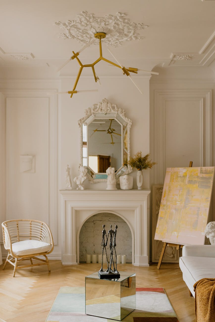
Living Room: Layer It Up
As seen in the Fenton & Fenton styled living area, the key to nailing this look is layering colour and texture. Textiles, artwork, furniture and ceramics combine to create a space that’s rich, playful and inviting. With warm-toned hues taking centre stage, there are almost no limits, the only rule is to keep your colours on the hotter side of the spectrum.
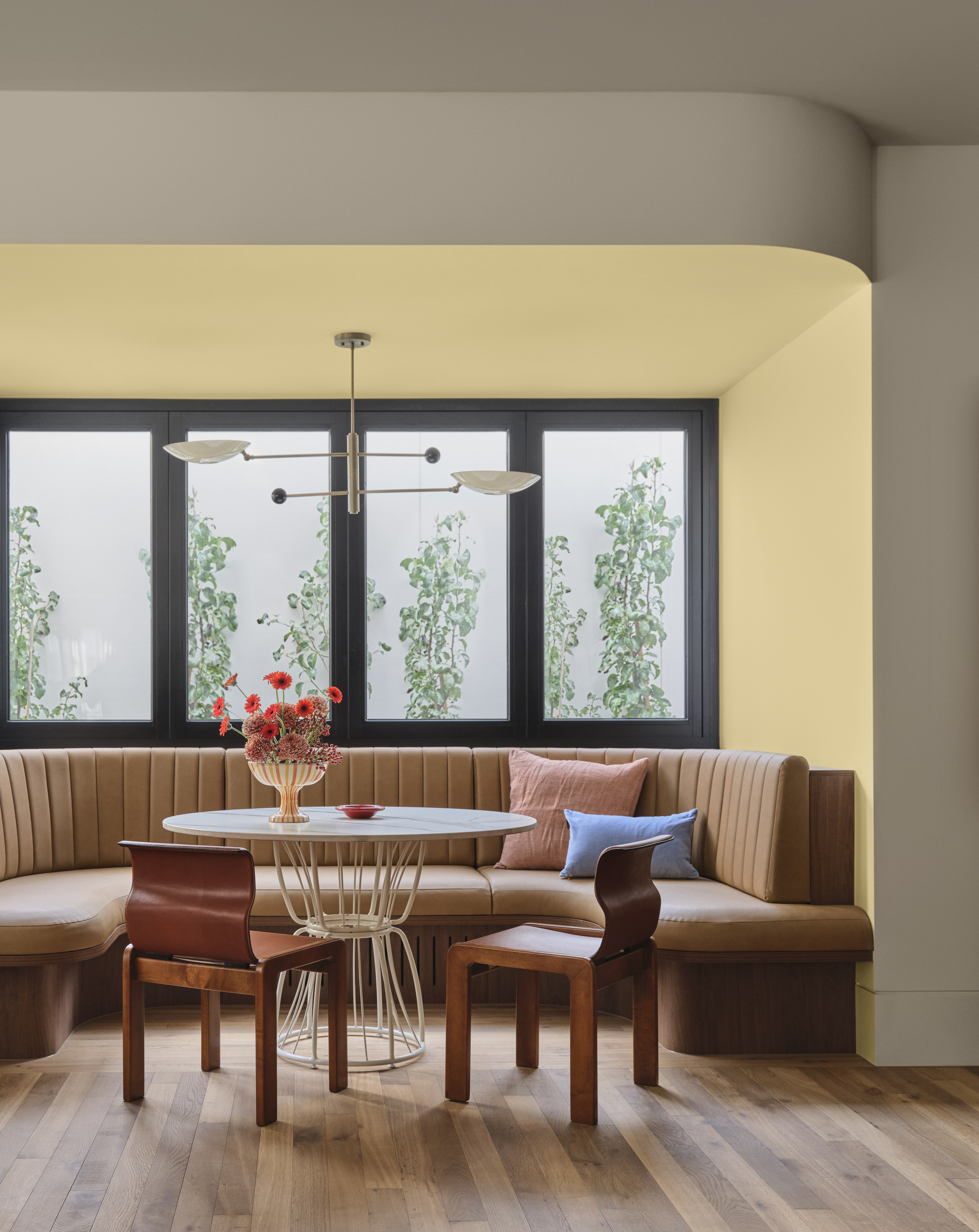
Dining Room: Appetite for Colour
The dining room becomes a vibrant hub with shades of saturated pink, orange and yellow, colours long recognised for their ability to stimulate appetite and energy. Here, Badaboom’s bold pink is cleverly balanced with earthy tones of tan, clay and chalk in the furniture and artwork. The contrast grounds the palette, making the room feel both dynamic and harmonious.

Bedroom: Vibrant and Restful
At first glance, colours like Schiaparelli pink, orange and turquoise may not seem like natural choices for a bedroom. Yet, when softened with layered textures, patterned textiles and breathable details like striped rugs and bedspreads, the effect is surprisingly soothing. The playful palette brings optimism and personality into a space usually reserved for calm, proving that bold colour can indeed belong in the bedroom.

Colour with Conscience
While colour is at the forefront of this collaboration, sustainability remains a top priority for Wattyl. Their I.D. Advanced Interior Paint features an ultra-low VOC formula of less than 1g/L, one of the lowest available on the Australian market, which means better indoor air quality once the painting is done.
The range is available in Matt, Low Sheen and Satin finishes, with a dedicated ceiling product to complete the look. Swatches, sample pots and paint can all be ordered online at wattyl.com.au or found in-store at Wattyl Paint Centres, Mitre 10, Home Hardware, Crowies and other leading paint specialists.

With the new Ola Mexicola collection from Fenton & Fenton and the bold versatility of Wattyl’s Badaboom, this summer is all about confidence, joy and colour that tells a story. Whether you’re revamping your living room, refreshing the dining space or adding personality to the bedroom, these shades prove that playful palettes can transform a house into a vibrant, lived-in home.


Leave a Reply