
Dulux Colour and Communications Manager, Andrea Lucena-Orr shares her top tips on the latest colour trends and how to incorporate colour into our homes.

Mid-Tone Colours
It’s all about the mid-tone colours! Every Colour Forecast is significant, as we look at colour and design influences and how they are evolving. This year’s palette steps deeper into mid-tone colours, to evoke sentiments of warmth, nostalgia and self-expression.
With key mid-tone colours such as Dulux Evening Blush, Dulux Lama and Dulux Bryophyte found in the Solstice, Journey and Muse palettes of this year’s Colour Forecast, the 2024 colour landscape offers flexibility sure to appeal to Australian homeowners looking to take a leap of faith towards colour confidence.
Mid-tones work best when used on all four walls, particularly in bedrooms and living spaces. If you are looking to add a fresh lick of paint to a smaller space, consider using less volume on either one or two walls for a more balanced colour scheme.


Colour Confidence
As we continue to gradually move away from cooler whites, Australians are taking the opportunity to become more confident with their choices. In the past, we have often chosen to stick to neutral schemes rather than being bold, particularly with our larger communal living spaces.
It is important to remain considered and ensure that you think carefully about the colours that will work well with the existing décor, fixtures and furnishings in your home. Use your imagination and create a mood board prior to painting, where you can lay out any ideas and creative thoughts in one place before purchasing Dulux Sample Pots or A4 Stickers to see how your chosen colours look in your home’s natural light conditions and with surrounding colours.
Confidence is all about trusting your initiative, and keeping in mind that paint can always be easily painted over if you want to make another change further down the track.


Embracing Warmth
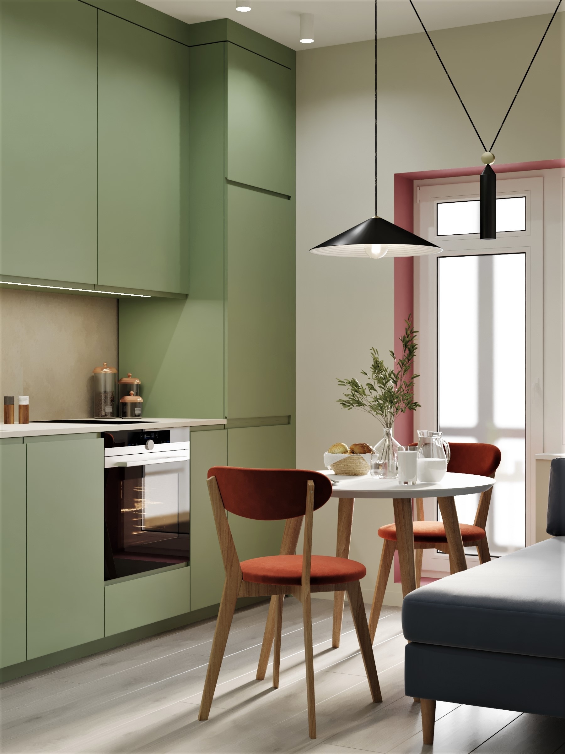
We are seeing an increase of warm tones across each of the 2024 Dulux Colour Forecast palettes with a yellow influence, pink undertones that appear in clay hues and reddy browns, olive green and accents of pale blue and zesty yellow.
These predominant hues are a reflection of post-pandemic life, and the reality of being in the midst of the cost of living crisis, as consumers look to add positivity by adding colour to their homes. The warmth is designed to evoke a comforting, familiar and inviting feeling at home, pairing well with our search for connectivity and entertaining.

Balance Through Colours and Textures
2024 has seen a move towards richer colours and an overall sophistication of our home spaces. Before you start painting, it’s crucial when selecting colours for walls or soft furnishings that you consider other fixtures and fittings in your space that you can’t change easily. This may be carpet, tiles, laminate or stone, and/or curtains and blinds that you will need to ensure work with your chosen colour scheme. Colour is an emotive, transformation tool which can help you feel connected to your space.

Originally published in ele HOME Magazine Issue 10
Want more? Click here for Embrace Joyful Living – Bringing in Colour to Your Home with Dulux


Leave a Reply