In recent years, a design aesthetic that’s often been dubbed the “Sad Beige Mum” trend has sparked conversations in the world of interior design. This term, which pokes fun at an overly neutral, monochromatic approach to decorating, is becoming a point of contention among homeowners and designers alike. But is this trend simply an expression of comfort and timeless style, or does it represent a missed opportunity for creativity and vibrancy in our living spaces? Let’s take a closer look at the “Sad Beige Mum” trend, what it means for the world of interior design, and why it may need a rethink.
What is the “Sad Beige Mum” Trend?
The “Sad Beige Mum” trend is a term that has emerged on social media and design blogs, poking fun at a particular style of home decor that is dominated by muted, neutral tones — primarily beige, taupe, and grey — with minimal variation. Think Kim Kardashian’s Calabasas home or Molly-Mae Hague’s Molly Maison. This design often includes beige walls, beige furniture, and beige accessories, all paired with similar-toned wood finishes. It’s a trend that tends to shy away from bold colours, textures, and statement pieces in favour of safe, understated choices.
The phrase itself evokes an image of a well-meaning but uninspired approach to home decorating, typically associated with middle-aged mothers or suburban homes in the 2000s and early 2010s. The trend’s critics suggest that it’s emotionally flat, uninspiring, and reflects a lack of personality in the spaces we spend most of our time in.

Why Did the “Sad Beige Mum” Trend Emerge?
In many ways, the “Sad Beige Mum” aesthetic represents a response to the more vibrant, eclectic styles of the 1990s and early 2000s. For decades, design trends leaned towards bold colours, large patterns, and maximalist approaches, often characterised by mismatched furnishings and dramatic statements. After this, the cultural shift towards minimalism and Scandinavian design in the 2010s played a significant role in the rise of neutral, monochromatic interiors.
Neutral tones, including beige, offer an easy, safe solution for homeowners who want a calm, relaxed space without making bold choices. Pantone’s 2025 Colour of the Year, Mocha Mousse, is a perfect example. They’re versatile, they pair well with a variety of other colours, and they have an inherent sense of serenity. For many, beige is comforting, quiet, and simple—qualities that make it appealing in homes where people want to unwind or escape our ever turbulent world. However, over time, the constant use of these muted tones has led to an overwhelming sense of blandness, which is where the “Sad Beige Mum” trend gets its name.

The Drawbacks of the “Sad Beige Mum” Trend
While there’s no denying that neutral colours have their place in design, especially in creating tranquil, welcoming spaces, the overuse of beige and similar tones can lead to several drawbacks. Here’s why some believe the “Sad Beige Mum” aesthetic has become stale:
1. Lack of Personality and Individuality
One of the primary criticisms of the “Sad Beige Mum” style is that it lacks individuality. Homes that rely too heavily on neutral tones can sometimes feel generic and impersonal. They may lack the warmth, flair, and expression that make a space feel truly lived in. Without vibrant colours or unique design elements, it’s easy for a room to feel dull or forgettable.
2. Missed Opportunity for Creativity
The world of interior design offers endless possibilities for creativity. Colours, textures, patterns, and furniture choices provide opportunities to express personality, culture, and style. By sticking to beige, many homeowners may be missing out on the chance to inject character and joy into their spaces. A room that feels “safe” can also end up feeling uninspired and stagnant.
3. Visual Boredom
While neutrals are often calming, an over-reliance on beige can create visual monotony. This can lead to a lack of excitement or visual interest in a room. Texture and tone variation are key in avoiding the “flat” look that comes with an all-beige environment. Without interesting textures, patterns, or pops of colour, rooms can easily feel drab and uninspiring.
4. A Trend That’s Hard to Escape
The appeal of neutral tones is that they are timeless — they don’t go out of style. However, the downside is that overuse of beige in interior design can become dated, especially when it feels like every room in every home is decorated with the same palette. The ubiquity of beige tones can make them feel stale or predictable.
What Should Replace the “Sad Beige Mum” Trend?
So, what does the future hold for those caught in the grip of beige decor? Thankfully, the interior design world is shifting toward more dynamic, personalised, and expressive spaces. Here are a few ways to break free from the “Sad Beige Mum” look:
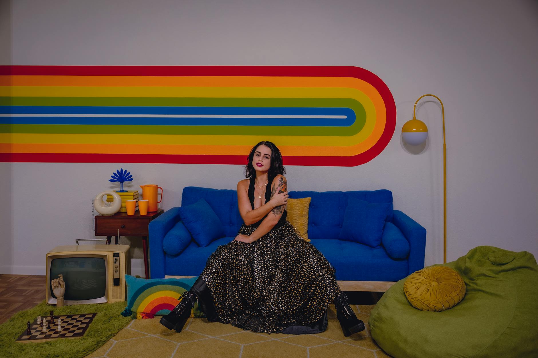
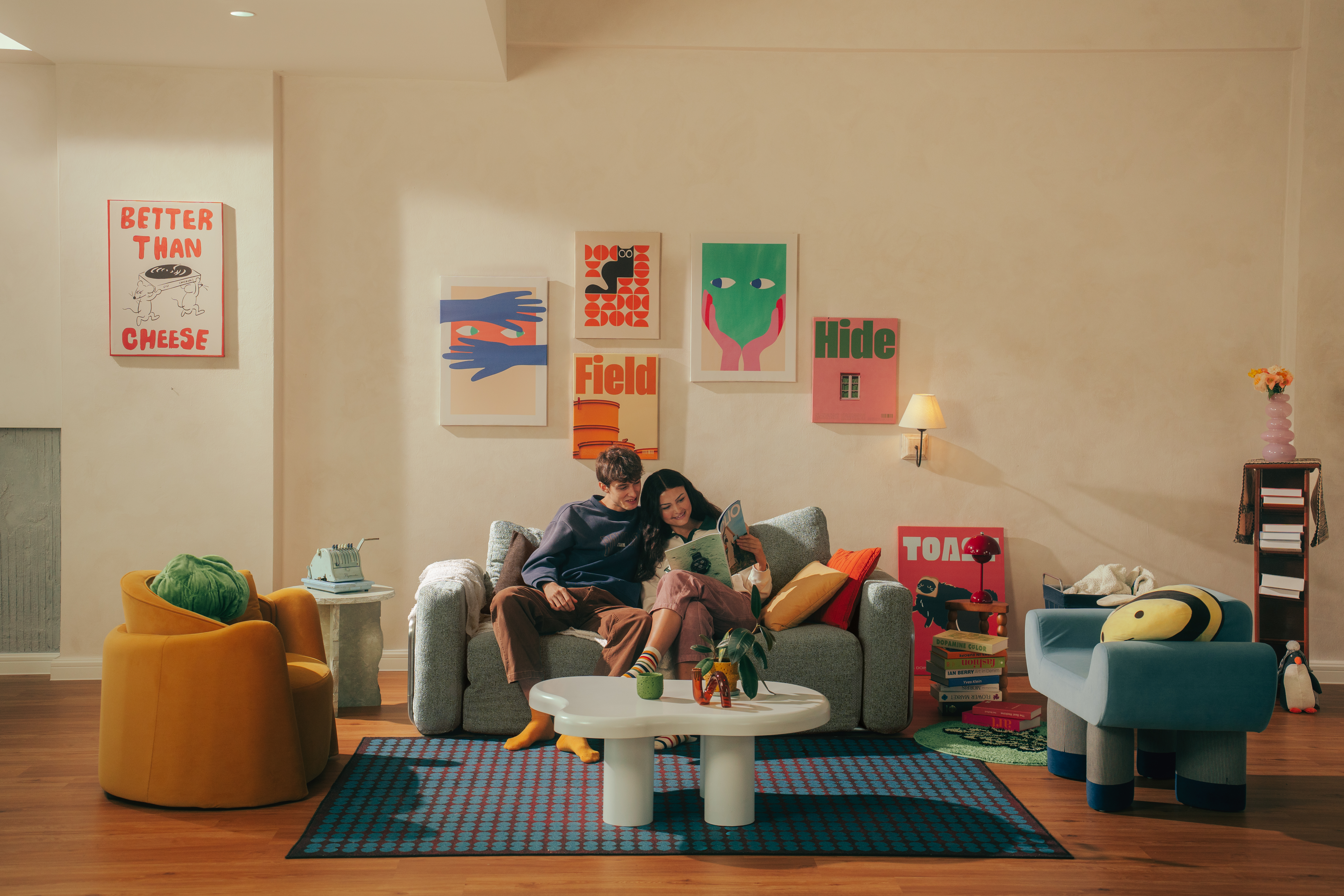
1. Incorporating Bold Colours
Bold colours are making a comeback. From rich jewel tones like emerald green and sapphire blue to earthy hues like terracotta and mustard yellow, 2025 will be the year for colour. These shades add energy, depth, and warmth to any space, helping to break up the monotony of beige.
2. Layering Textures
To avoid visual boredom, it’s important to incorporate a variety of textures and finishes into a space. Think velvet cushions, linen throws, rattan furniture, and wool rugs. Layering textures creates depth and interest in a room, making it feel more dynamic and inviting.

3. Statement Furniture
Instead of relying solely on neutral-toned furniture, consider incorporating statement pieces that add character and personality to your home. Whether it’s a vintage armchair, a bold-patterned sofa, or a unique coffee table, these pieces can be the focal points of a room and serve as conversation starters.
4. Mixing Modern and Vintage
One way to add individuality to your space is by blending modern design elements with vintage or retro pieces. This combination creates a unique, personalised style that tells a story and reflects your personality, rather than sticking to a cookie-cutter aesthetic.
5. Sustainable and Eco-Conscious Choices
A growing trend in interior design is the move towards sustainable, eco-friendly materials and furnishings. Think reclaimed wood, organic cotton fabrics, and natural fibres. These choices not only add texture and interest but also reflect an increasing awareness of the environment.
While the “Sad Beige Mum” trend might have once been a symbol of comfort and simplicity, it’s clear that the world of interior design is moving towards bolder, more vibrant expressions of style. The key to a beautiful home is creating a space that reflects your personality and lifestyle, something that’s hard to achieve with neutral tones alone. By embracing colour, texture, and unique design choices, homeowners can break free from the beige trap and create spaces that are both comfortable and exciting. So, let’s say goodbye to the sad beige aesthetic and embrace a new era of design that’s filled with personality, creativity, and joy.
Want more? Click here for Australian Real Estate Hotspots Predicted to Boom in 2025

Leave a Reply